I complete this exercise in the time of COVID lockdown, so rather than go and purchase a supplement magazine specifically for this, I grabbed a special interest magazine from my shelves and tore out an advertisement from it instead. The magazine in question is Singletrack, a magazine dedicated to mountain biking.
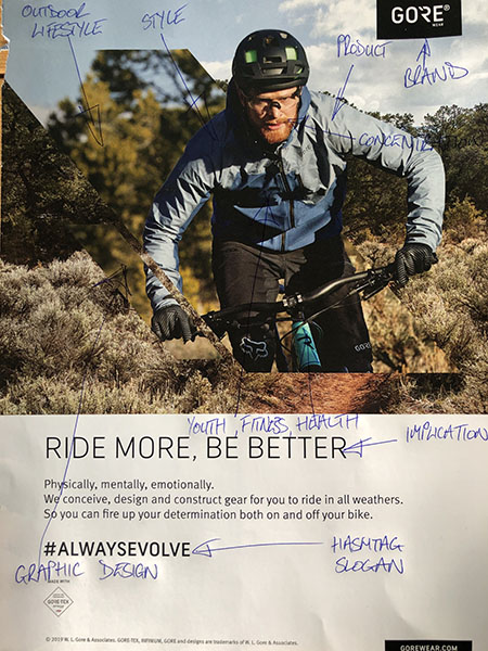
When initially scanning the image, it is not completely obvious as to the product promoted in the advertisement; you have to put the relative information from text and image together to form a conclusion.
First line of sight is drawn to the figure. He’s young, looks fit and healthy and is engaged in in the physical activity of riding a mountain bike. There is a very determined, focused and concentrated look on his face, as if he would be in peril if he lost his concentration; the implication being that the figure is risk adverse. Along-side this, there is also a strong sense of masculinity, an overriding feeling of the strong, determined male; a quasi-heroic figure of Greco athletic prowess. The suggestion being that riding a mountain bike improves manliness.
I am next drawn to the bold box of text in the top right-hand corner. The word has a registered symbol next to it so I can ascertain that this is the brand and my memory fills in the gaps. I know that Gore is the shortened version of Gore-Tex, a water-proof fabric, and the logo is replicated on the breast of the figures jacket; therefore, the product is the jacket. This information is further enhanced by the text underneath the image. The slogan ‘Ride more, be better’ implies an improvement in your riding technique can only be gained by more and more riding. How can this be achieved? ‘We conceive, design and construct gear for you to ride in all weathers’, is the answer. The manufacturer is past implication now, they are telling you ‘Wear our jacket and you too can ride in all weather’s; therefore, you can spend more time on your bike and be a better rider’.
The jacket is quite stylish too. The two-tone blue banding relates to calm and gives the jacket a subtleness that hints at confidence, of not needing to draw attention to oneself. The cut and style of the jacket is best suited to those with an athletic shape to their body and could be worn out of context, yet people would still know that the person wearing it was sporty.
The imagery is made up of two composited images. First, there is the main figure, the man, intently focused with an out of focus background. Overlaid on top of this is an image of bush or scrubland with its red sand path. The way that the overlay is constructed heightens the sense of being in the outdoors. The strong diagonal composition of the overlay gives a feel of speed; of hurtling through the bush. The frozen bushes are not something that is usually seen when travelling at speed, so, to freeze them highlights the risk the rider is experiencing – that of having to pick his path through the scrub at speed. The design further enforces the slogan and product; ‘In our jacket you can ride more and be better’. Also, the graphic design of the overlay hints at experimentation and with that innovation. It says to me that the brand like to be trying out new approaches, that they don’t rest on their laurels.
The final point of interest is the hashtag slogan. Immediately it signifies youth. It is a symbol connected to those with a social media presence, commonly attributed to youth culture and it implies that the brand is part of a 21stcentaury lifestyle.
So, the advertisement is telling me that to improve myself, to be better, I need to get outdoors more and ride my bike more and the best way to do that is by wearing a stylish Gore-Tex jacket that enables this. Also it enables me to be more of a man, not unlike a Marlboro cigarette advertisement, but fitter.
