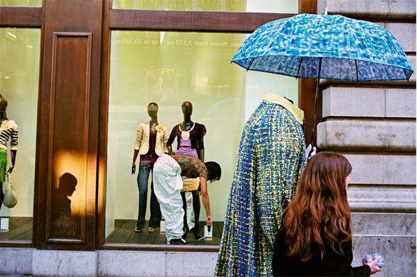
I have to start by saying I am not a great user of Photoshop nor am I a great believer in it either. That’s not to say I don’t appreciate work that has been ‘shopped’, I guess it stems from frustrations that I’ve encountered previously, resulting in a lack of confidence with it. Generally, I use Photoshop for image resizing and other simple functions. I saw this exercise and had a feeling of mild dread at the thought of completing it.
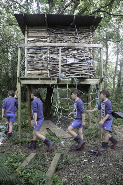
I’m into action sports and over the years have seen sequence composites in magazines such as Thrasher (skateboarding), Surfer and Dirt (mountain biking) and have always been impressed with the technique but also the way it conveys a passage of time. I thought I’d use this technique to create a metaphor to highlight the passage of time from child to teenager, by using my son as the subject.
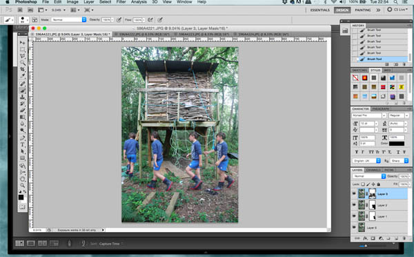
Regarding the technical aspect, it wasn’t as hard as I had envisioned. I took a series of images in sequence with my camera mounted on a tripod. Selecting four images, I then opened these in Photoshop. Selecting a background image, I then created three extra layers and copied the remaining images into these respectively. Next, I used the auto-alignment function and cropped any un-aligned areas. Finally, I used the layer mask function and on respective layers I painted on the figure/figures from the previous layer, resulting in the final image below.
I have to say that I’m pleased with the results and the exercise has given me confidence to use and experiment with Photoshop in future. I also think that it has successfully conveyed the passage of time and has fulfilled the brief in creating a documentary photograph that could never actually be.
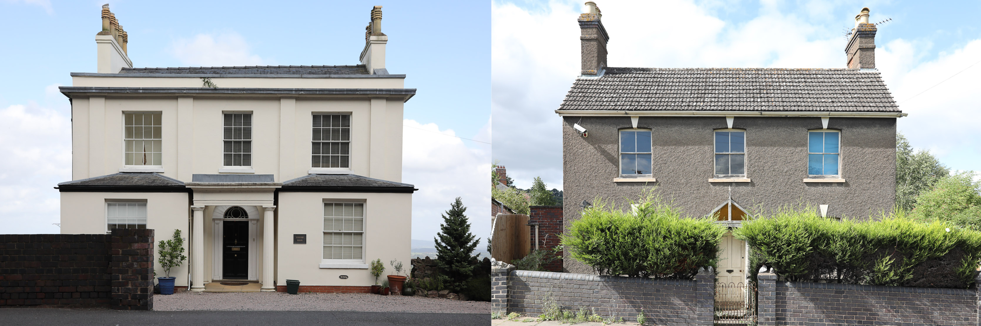
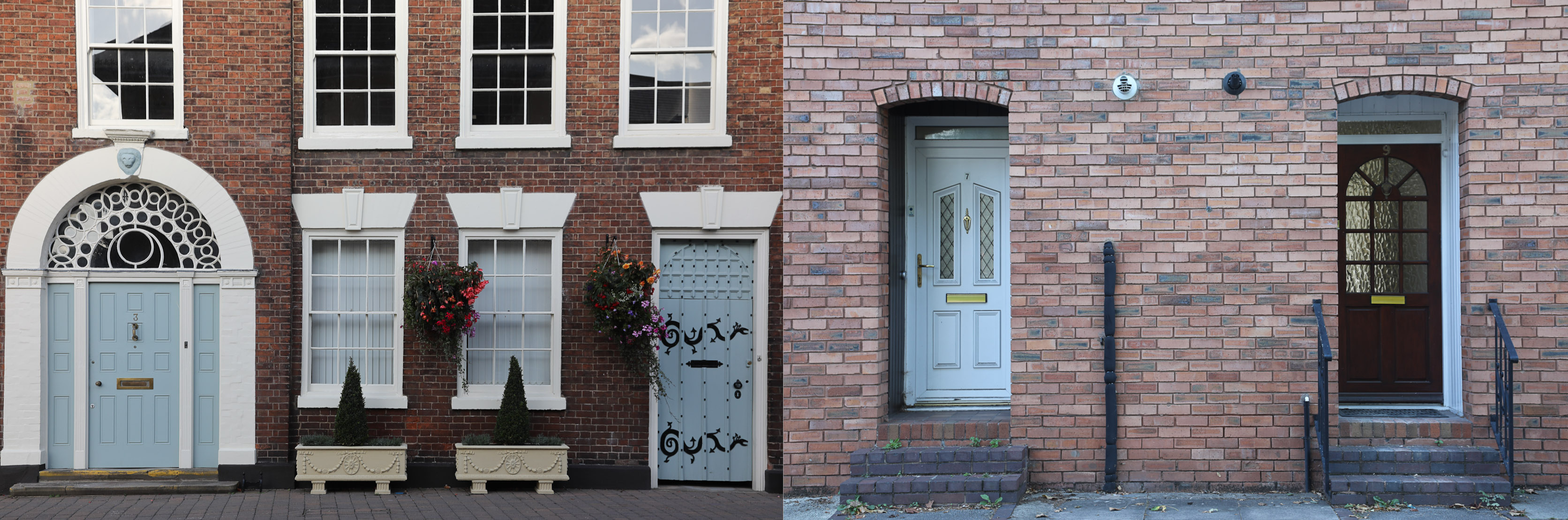
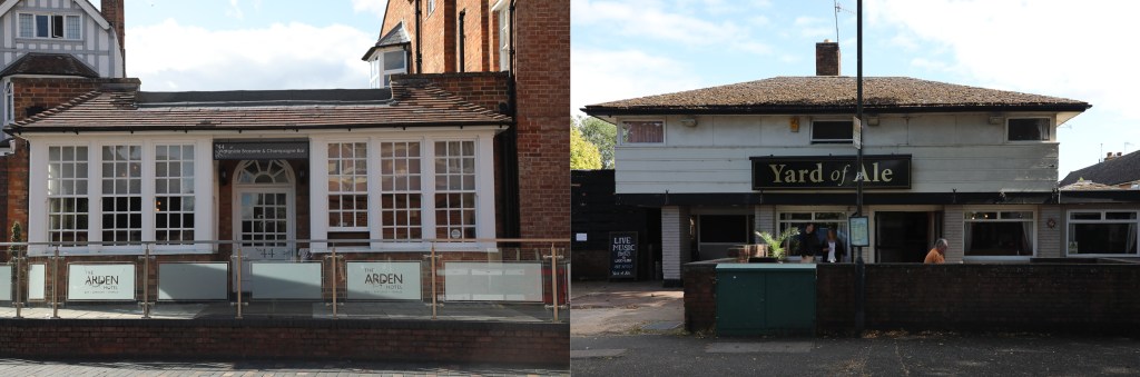
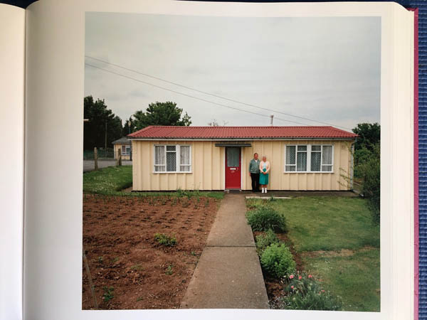
My aim for this assignment was to show the juxtaposition of the class divide within British society through the prism of our housing usage.
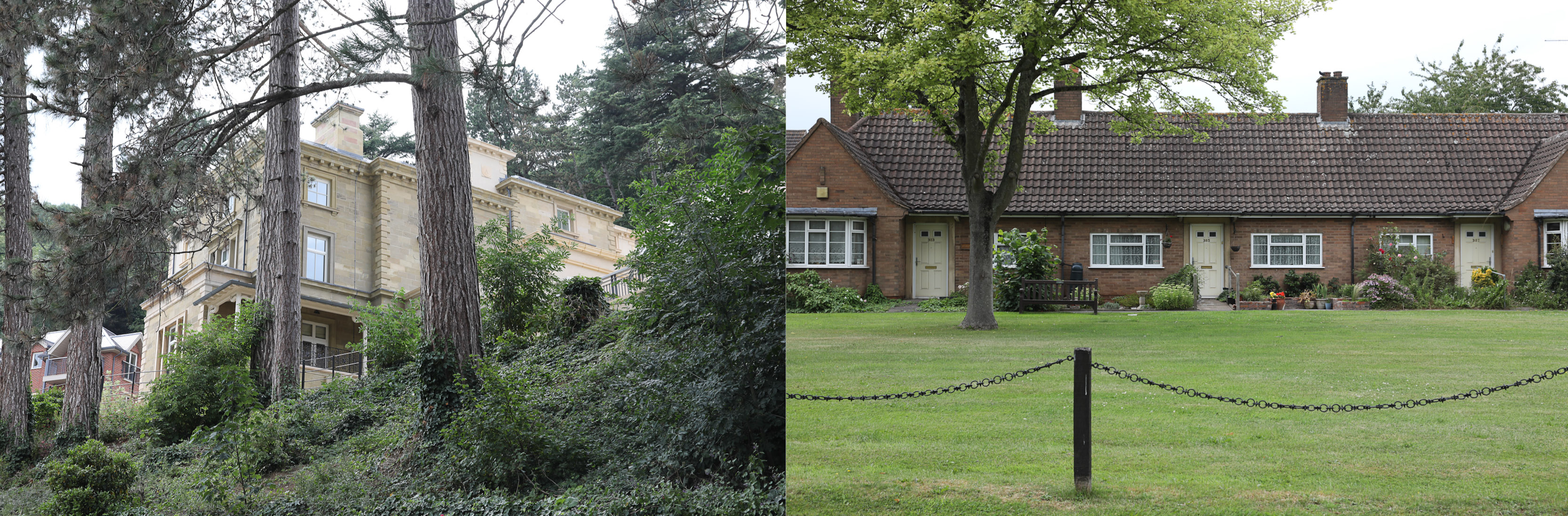
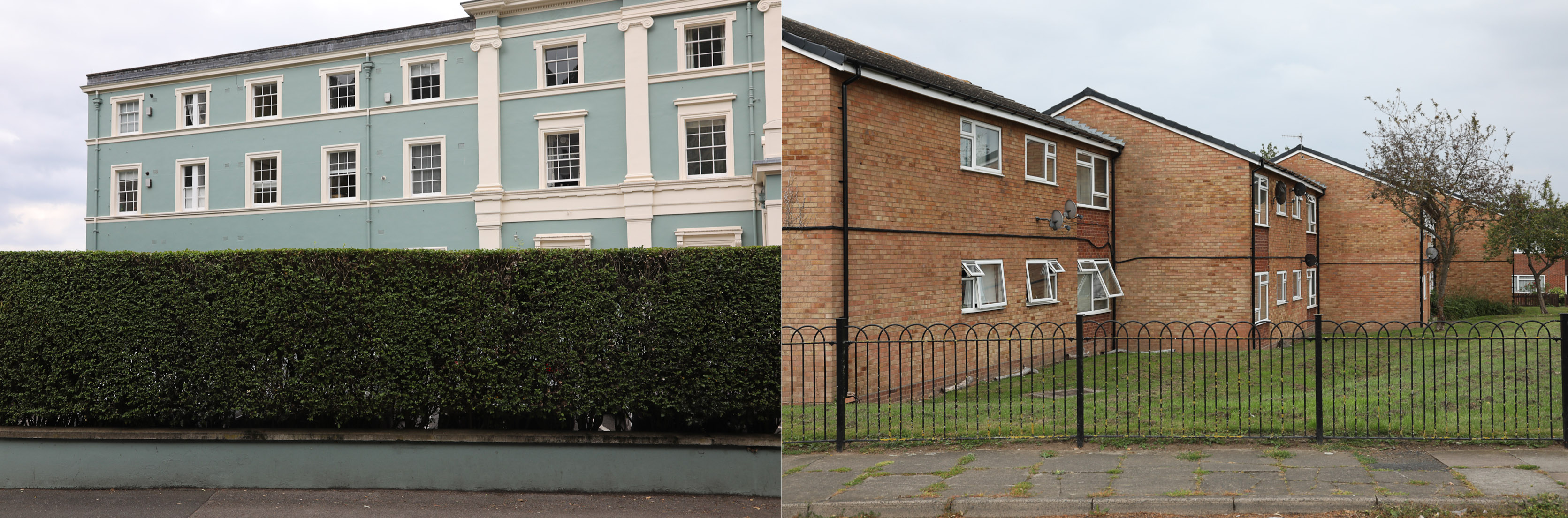
Early on, when collating my initial ideas for this assignment, I decided the best way to illustrate this was by having similar images presented side by side in the form of diptychs, to highlight the disparity in the class divide. I laid down some stringent parameters to aid with continuity within the set of images. The first of which was that all of the images were to have a dead pan aesthetic, secondly, they had to be devoid of human content, also, although they didn’t have to be topographic, I wanted to ensure similarities between the images, enabling them to work as pairs. Other parameters were that the buildings had to be of the same type, and, importantly, the buildings had to be in the same town.
Once I had scouted and identified buildings to shoot – no mean feat, especially finding a working class detached house to match a regency detached – the biggest challenge was to maintain consistency of lighting. Typically, our summer yielded a variety of conditions and as shooting took place on numerous days this proved to be my biggest challenge.
Overall, I am pleased with the results. There are matches in the images in all of the sets, whether it be the environmental setting of the elderly housing; the perspective and boundary markers in the flats; the topographic style of the detached houses and the pairs of doorways for the terraces. Another thing I’m pleased with is learning some new post production skills, that of, correcting converging verticals and also how to construct diptychs in Lightroom. I have one niggling concern and that is the light in the second detached house doesn’t quite replicate the former, maybe I’m being a little picky.
There was one image that didn’t make the final edit and this was down to a number of factors. I waited in hope for nearly an hour for the sky to cloud over to reduce the shadow/highlight contrast in both images and the people in the second image just wouldn’t shift – breaking one of my self-imposed rules. I took the image knowing full well that I wouldn’t use it, but I guess I needed to see how they worked. The other reason was that all the other sets were of homes and this just seemed too out of place.
At the time of writing this blog there seems to be more division on a worldwide scale than I have witnessed in my lifetime. Perhaps this is exaggerated through the prism of multiple media outlets; be it Twitter feeds, rolling news channels, radio and the obvious posturing from opposing newspapers regimes – or maybe since the financial crisis of the mid 2000’s populations are more aware and new technologies have heightened this awareness.
These divisions take form across multiple issues; trade, migration, xenophobia, political viewpoint, wealth and poverty, environment, religion and age-old geopolitical fault lines, all apparent in many societies across the world.
I became politically aware in my early teens, having the soundtrack of many punk albums spilling out of my bedroom, much to the annoyance of my parents. The lyrics informed my early political viewpoint. The anarchistic and anti-establishment thinking prevalent in so many of the records seemed to chime with my teenage angst. This was the early 1980’s and the Thatcherite ethos had tipped the political scales of the country towards a relentless pursuit of wealth and supposed free enterprise. The financial heart of Britain – The City of London – was unrestrained and divisions along lines of wealth where obvious in many parts of the country away from the south east corner. The music I was listening to highlighted the disparity between the classes; the greed of the wealthy over the need of the poor. Fast forward thirty years and nothing has changed, if anything, the old issues are magnified, the old divisions, have become more entrenched.
The class structure within British society is age old and a reflection of this are the buildings we use and occupy. Across every village, town and city within our country the division of class is set in stone. Ghettos of class are everywhere, and it is this which I intend to explore to show two sides of the story.
I decided to make my work on the buildings we use and inhabit to highlight the class divisions within our society. I had in mind a set of parameters I wanted to adhere to in regard of continuity – they were, that the buildings had to be within the same village or town and that they had to be of the same type. Other parameters included that the images were devoid of human subjects and were shot in a dead pan aesthetic but not necessarily topographic. The buildings I decided to shoot were; elderly housing, drinking establishments, detached housing, flats and terraced houses.
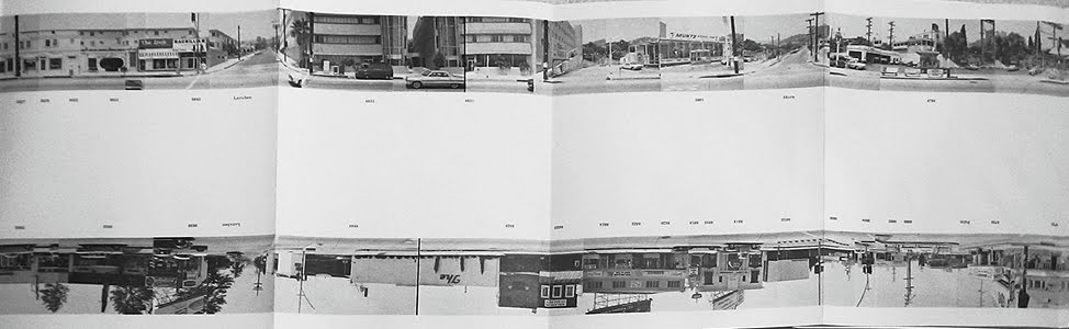
To help inform my work I looked at several photographers who had engaged in the documentation of buildings. The first of these was Eugène Atget and his pictorialist images of the suburbs of Paris during the late 19th and early 20th centuries. His images formed a record of Paris that was soon to be changed by huge program of modernisation. Next, I looked at the work of Ed Rushca. Ed, self-published a concertina book in 1966 entitled, Every Building On Sunset Strip, which shows both sides of a one and a half mile section of Sunset Strip in Los Angeles. The images for the book were made by mounting a camera on the back of a car and then he was driven up the road and made his images continuously. Then, he montaged the images together in a continuous format, resulting in a concertina book that measures a little over 7 meters in length. The work is shot in a dead pan, topographic style, and although often the images don’t match up this emphasises the passage of time taken during the undertaking of the journey. Finally, I looked at Martin Parrs series entitled Prefabs. These colour images document the prefabricated buildings that were erected to take up a huge housing shortfall in the post war years and although only designed to last for 10 years many have stood the test of time. Parr’s series shot in 1994 is close to a dead pan and topographic set but it seems to me that by including the inhabitants of the building and shooting in colour the images are elevated to a contemporary documentary series.
Ruscha, Los Angeles, 1966.
Authors Own, 2019.
My aim for my work is to present a juxtaposition of the class structure within our society in the form of buildings. At the moment my thoughts are to present the images as diptychs, my only doubt being how they will reproduce when presented side by side on an A4 print. I guess my concern is that I don’t want to reduce their effect when printing by reducing the size of the images too much by having them side by side on A4. We shall see.
Sarah Pickering’s project – Public Order, gives us an uncomfortable reality check on modern social structure. I admit to being unsettled at first view, not because of the images per se but because of the underlying undercurrent of well-practiced state control. The sparseness of her images, often strewn with debris, devoid of human content, gives the impression of a ghost town that has been at the sharp end of something rather sinister. The sombre colour aesthetic further enhances feelings of tension.
When absorbing the context of the images, my feelings are further solidified. The fact that this is a place to drill and drill again the practice of crowd control underlines my feelings of the states potential to abuse its power. I am able to visualise the possible scenarios being played out within the confines of the space. I know there is a need to be able to disperse the unruly mass, but I can’t get away from the fact that protest is often borne from injustice. This work ensures that I reflect on society and state.
For me, this is undoubtedly a very effective use of documentary. The work shows us a place that is not familiar and reveals it to us in incremental steps. We have to engage with it more to understand it, it provokes us to think. I think it is much more effective than work that is laid on a platter.
I find the whole process of photography thoroughly engaging, whether it be completing research, reading about its history or the act of making images and regarding this, since embarking on the photography pathway I feel I’ve come out of my shell with the range of images I’m making. I feel confident in tackling a range of subjects from street to still life, portraiture to abstract and much more in between. For some reason though, and I am surprised by it, I find myself being drawn to buildings and architecture. I understand that there is a link through my work and obviously I have a deeper understanding than many outside of construction, as to how buildings work and the arrangement of the spaces within. I’m also fascinated with the histories of buildings and the layering of the previous occupants psyche’s and the mental resonance left within. There seems to me a whole stratum of social concepts related to buildings and it’s this I wish to explore.
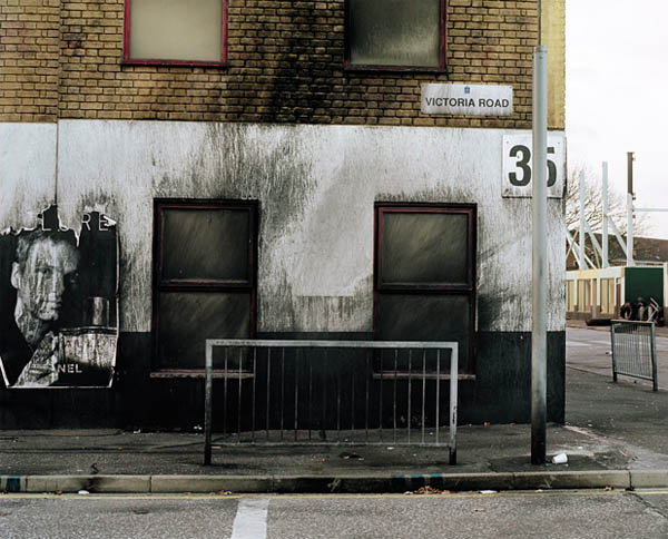
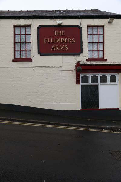
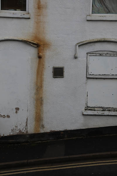
There was a specific moment that gave me impetus and furthermore direction with my approach to this assignment, and it came from a time of mourning. On an overcast, gloomy Sunday, I set off to take some pictures of a friend’s memorial tree. On my way there I passed a pub called the Plumbers Arms and felt obliged to take a picture (it’s my trade after all). When returning to my car I saw an interesting rust stain on the side of another building, so I made another image. I had been lost in thought and didn’t fully realise where I was, but, on turning around I saw that I was opposite the Plumbers Arms again. Although not exactly a eureka moment it did get me thinking on somehow relating Two Sides and my apparent recent fascination with buildings.
My first thoughts where about pursuing the two sides of the street and the possibility of neighbours view points of each other. Maybe this could open up questions of community, friendship, togetherness or the flipside of this; animosity, hatred, stubbornness and isolation. I think there is potential to bring into this idea a more social form of photography, perhaps looking at such things as class, regional identity and politics.
There is plenty of food for thought, and some ideas already simmering.
The thought-provoking nature of Paul Seawright’s Sectarian Murder series is the key to its success. As a viewer we have to engage more thought in the reading of the images – nothing is obvious. The work is more challenging than say, an image made in the immediate aftermath, with police cordon tape surrounding the scene and then reproduced in a newspaper – this would be purely photojournalistic. As he says in his video, this would give up its meaning too quickly, leaving the viewer no room for interpretation, the image would be explicit with an obvious and easy to grasp reading. By obfuscating his images, which become more apparent with added context of the written text – taken from journalistic print – in the immediate aftermath of the shootings, he transforms the images with a greater, more mentally engaging meaning. Add to this his own history to the area and the fact that he was growing up with murders occurring at regular intervals, helping shape his own understanding. This too, adds sensitivity to the work.
The crux of his argument when talking about his series is all about viewer interpretation. Paul doesn’t want the meanings lying within his work to be obvious, he wants the viewer to expend some mental energy in fathoming their own understanding of it. His aim is to give room within it, enabling the viewer to engage fully with it. All art should be engaging and not obvious.
I think that if a piece of documentary photography is defined as art, its meaning is changed. I’ll add a caveat, its definition as art is defined by the creator and their intent. For me a standard documentary image that features in a broadsheet, with easy interpretation does not hold the same allure as an image that is more challenging. Two photographers could embark on making work of the same subject with differing outcomes – one artistic and the other documentarian, I’m sure the meanings would differ greatly when comparing the two works.
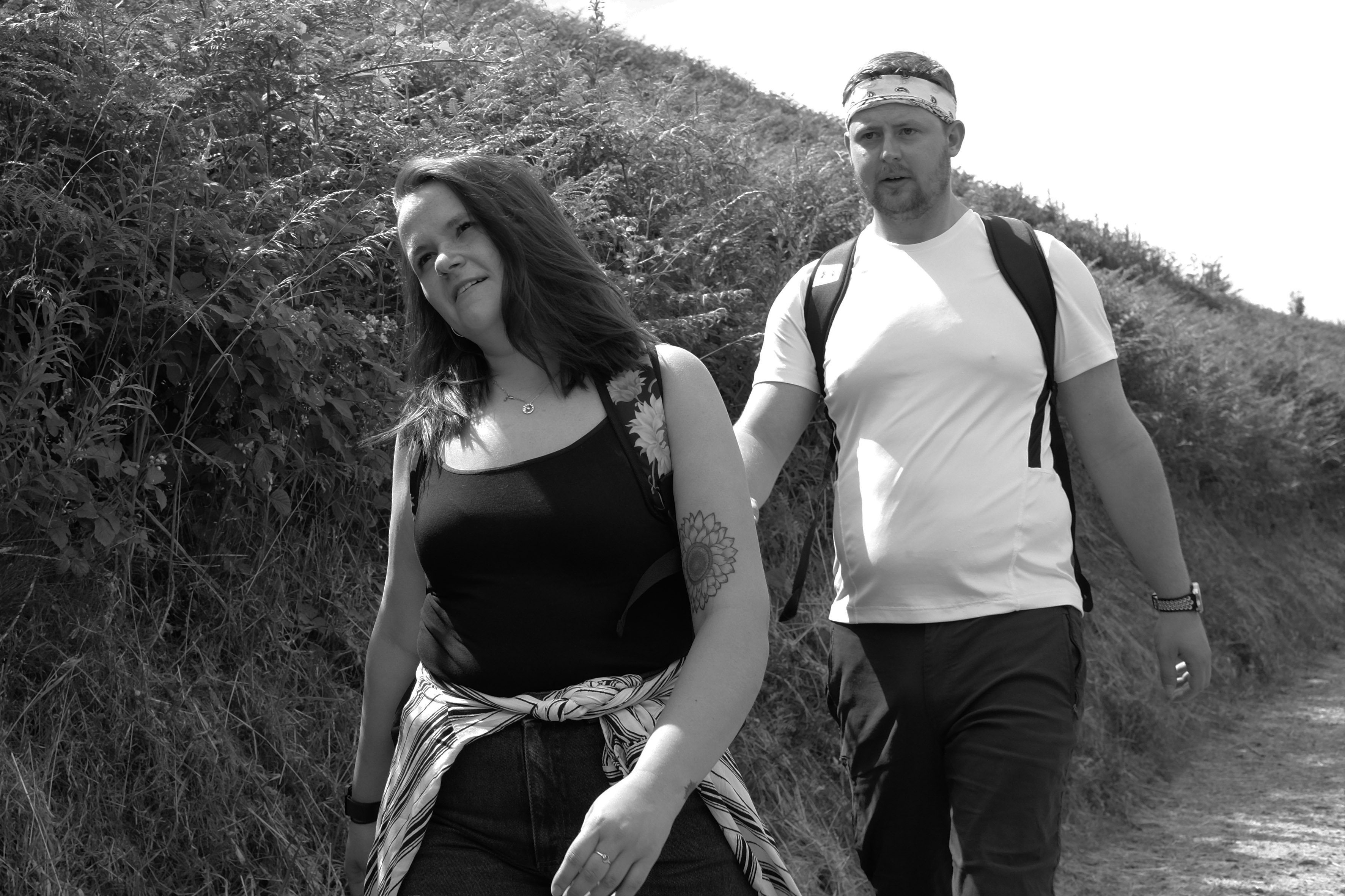
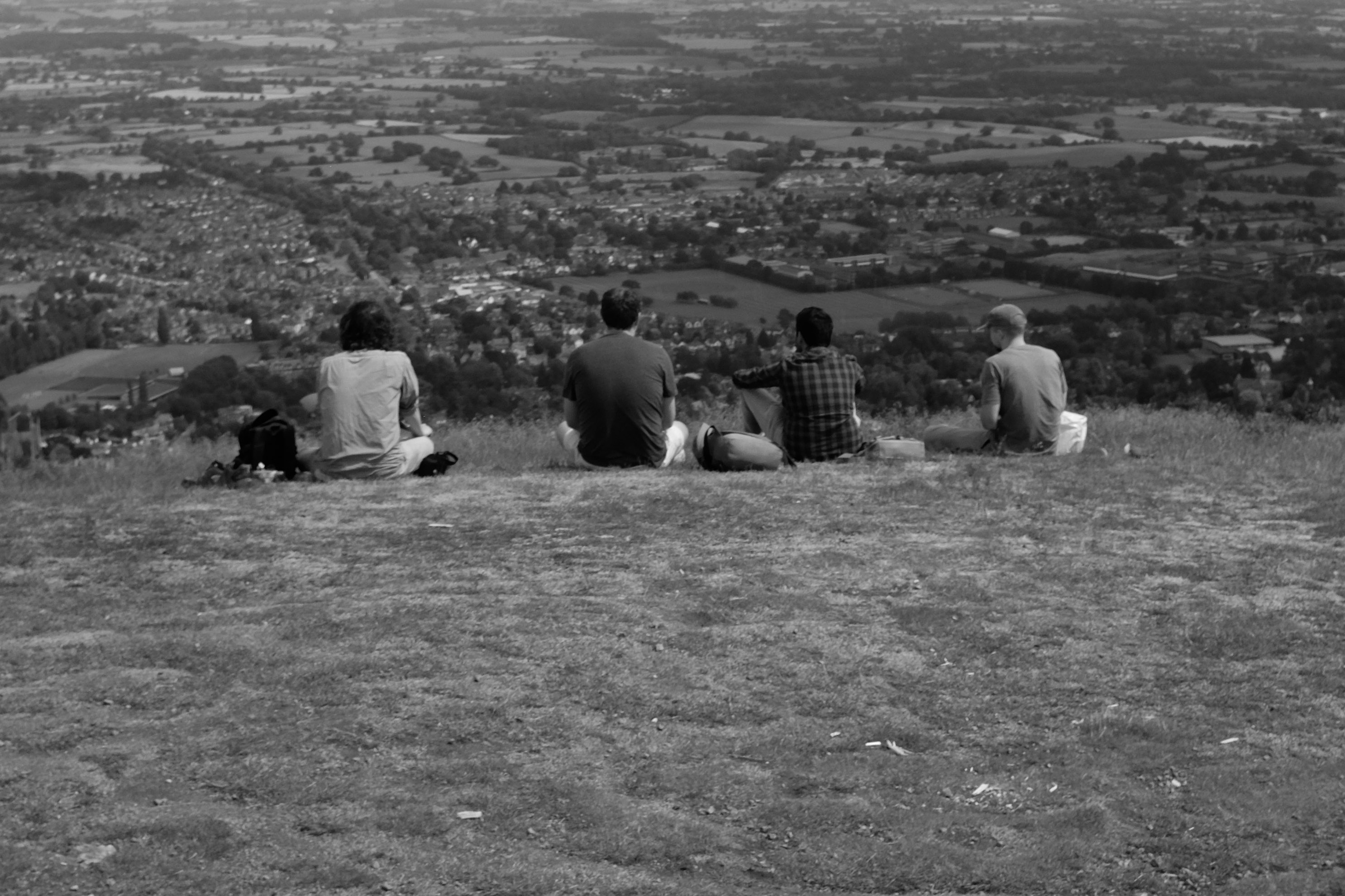
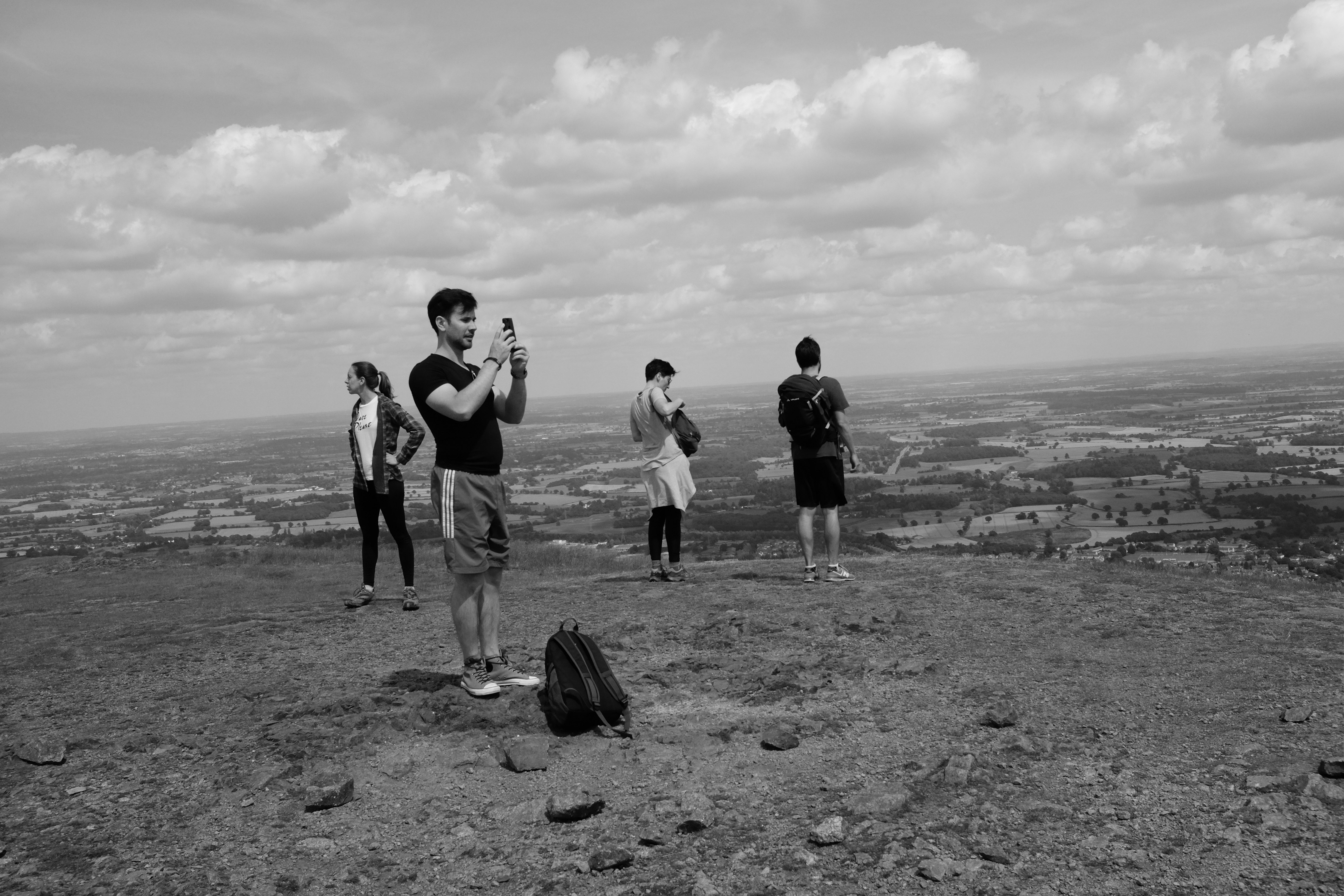
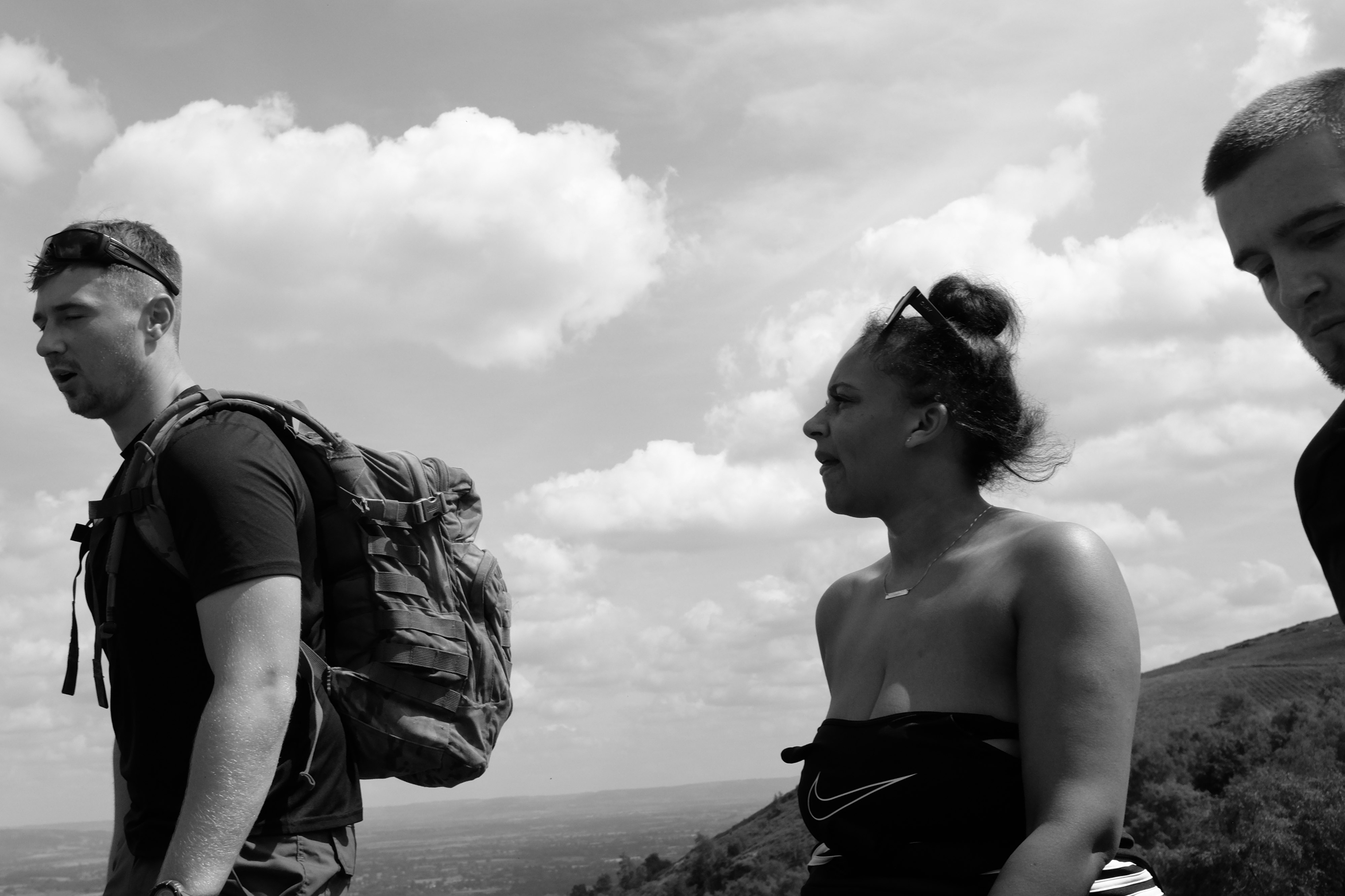
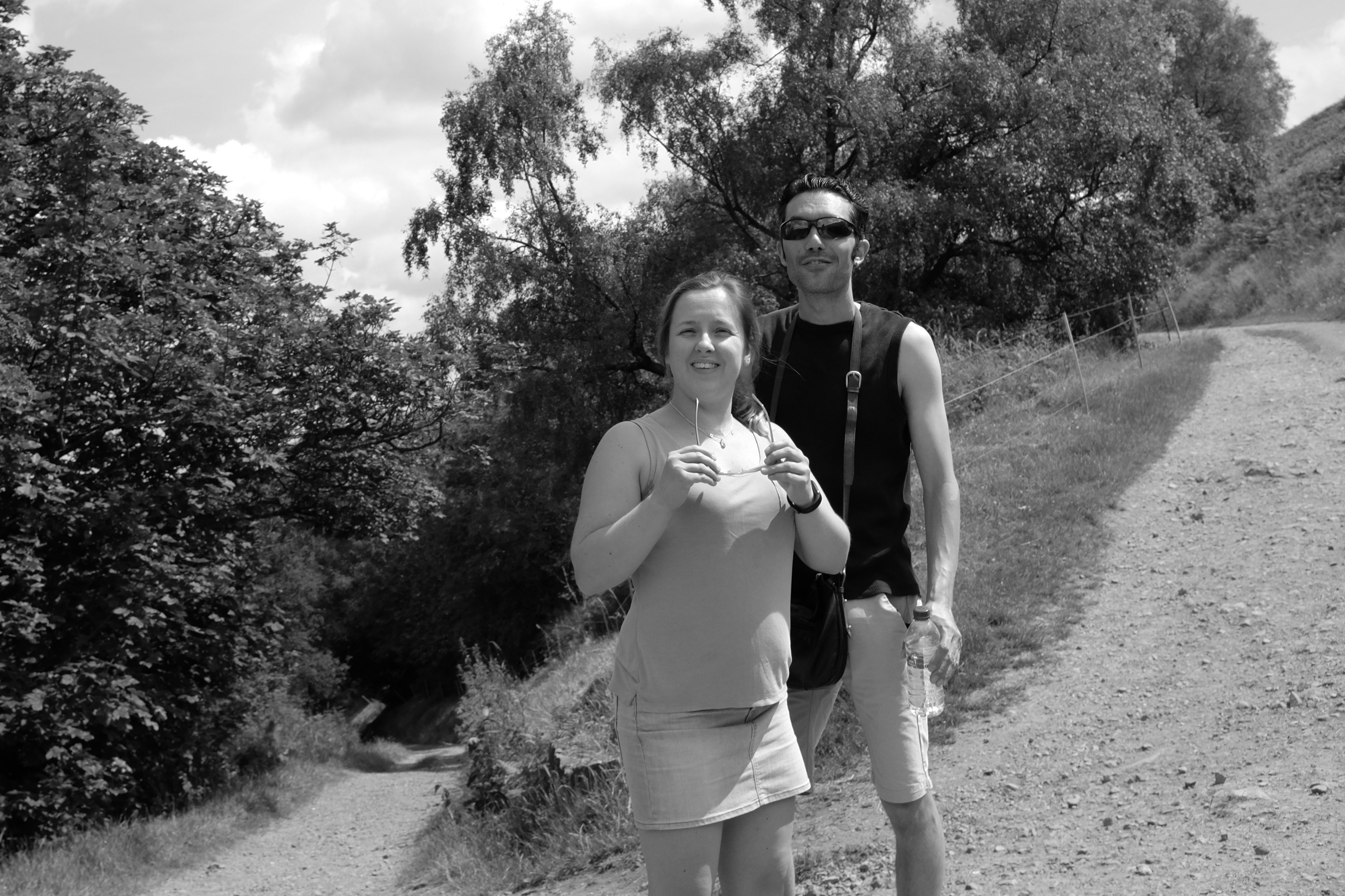
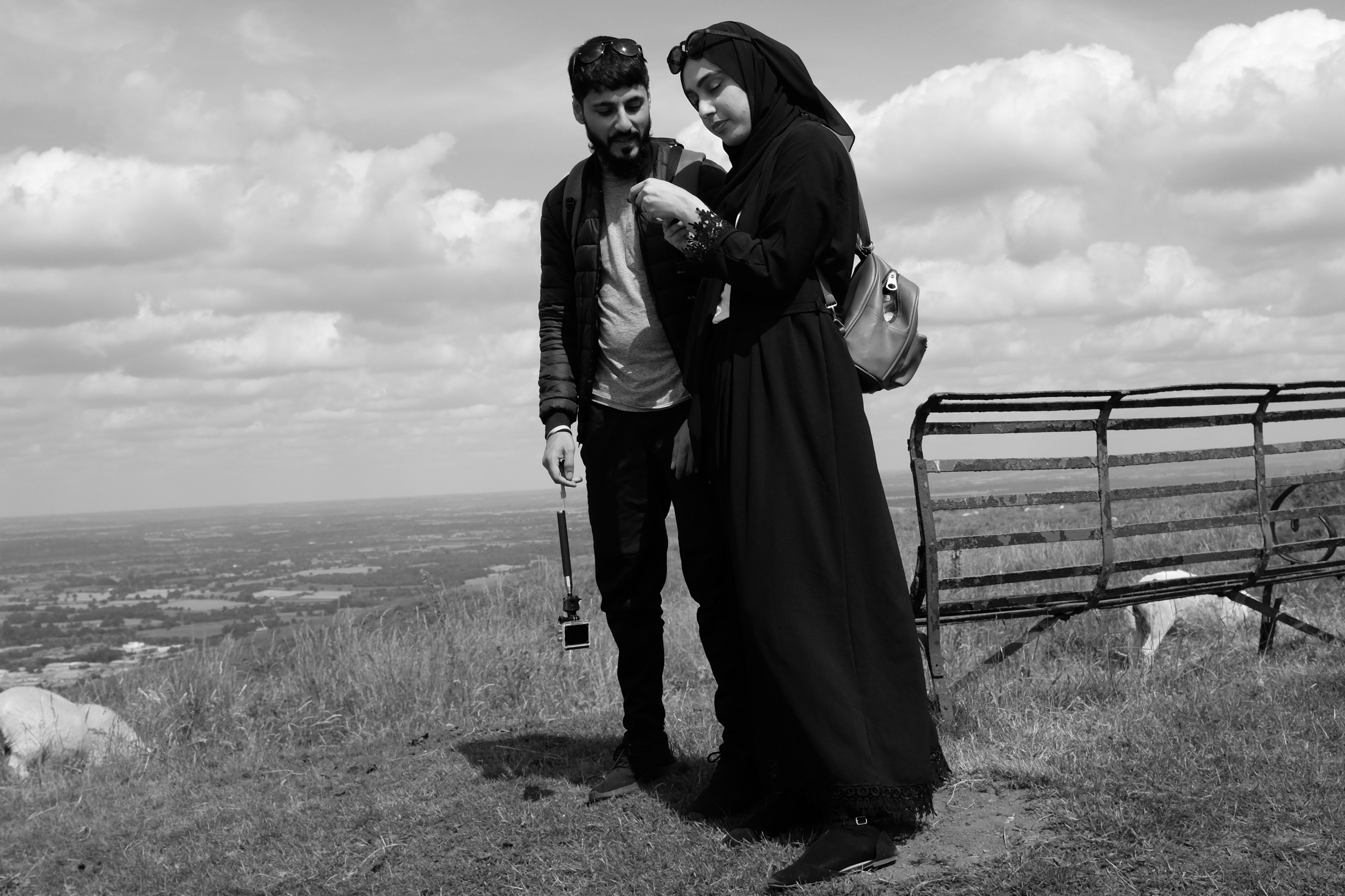
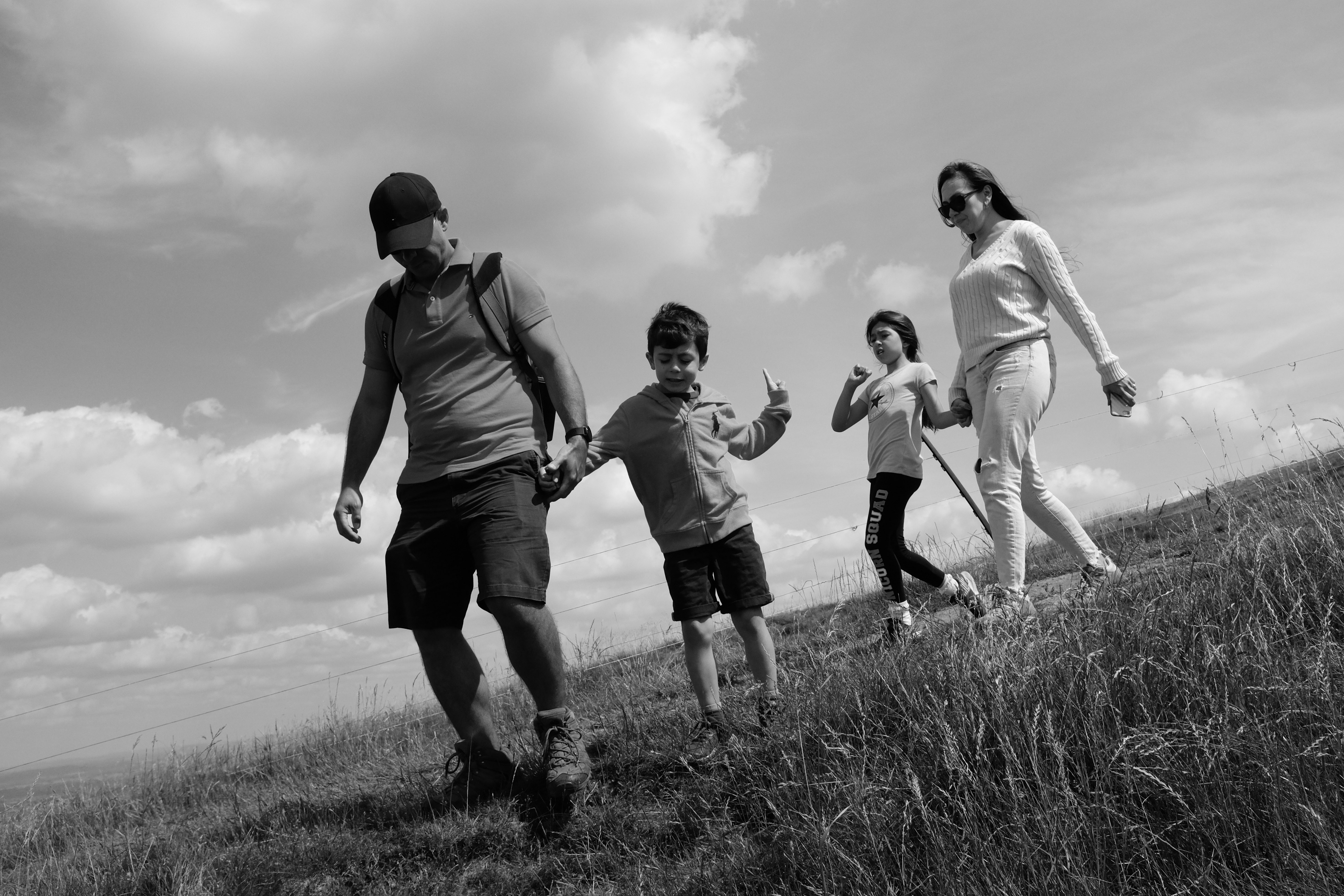
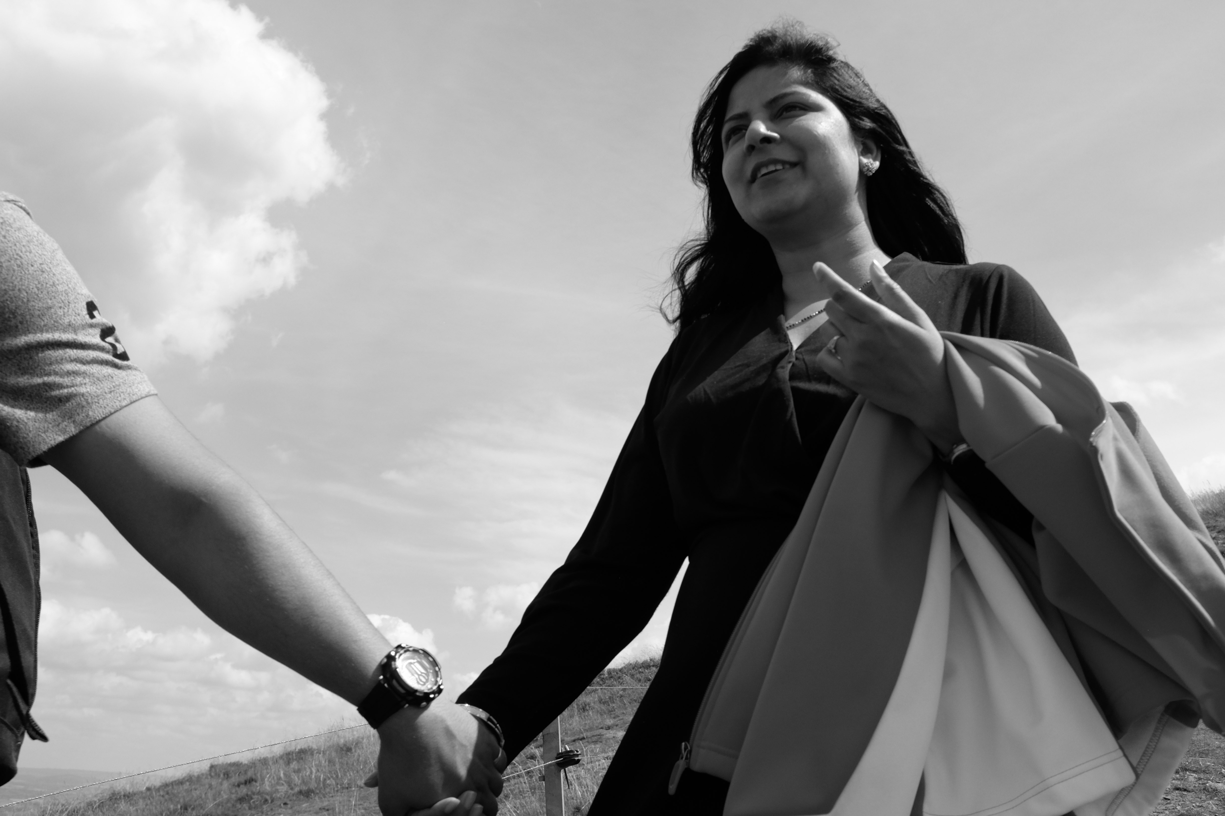
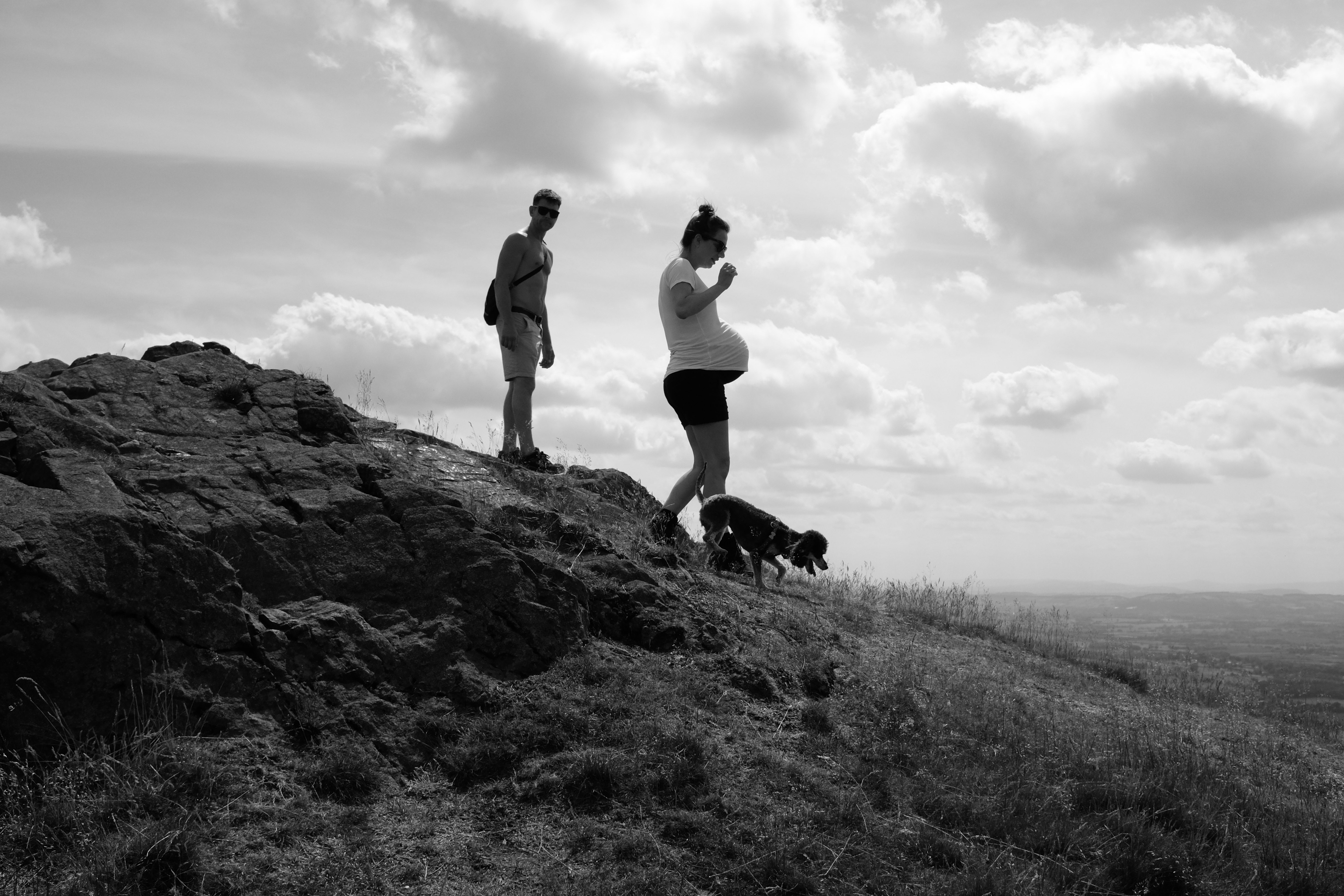
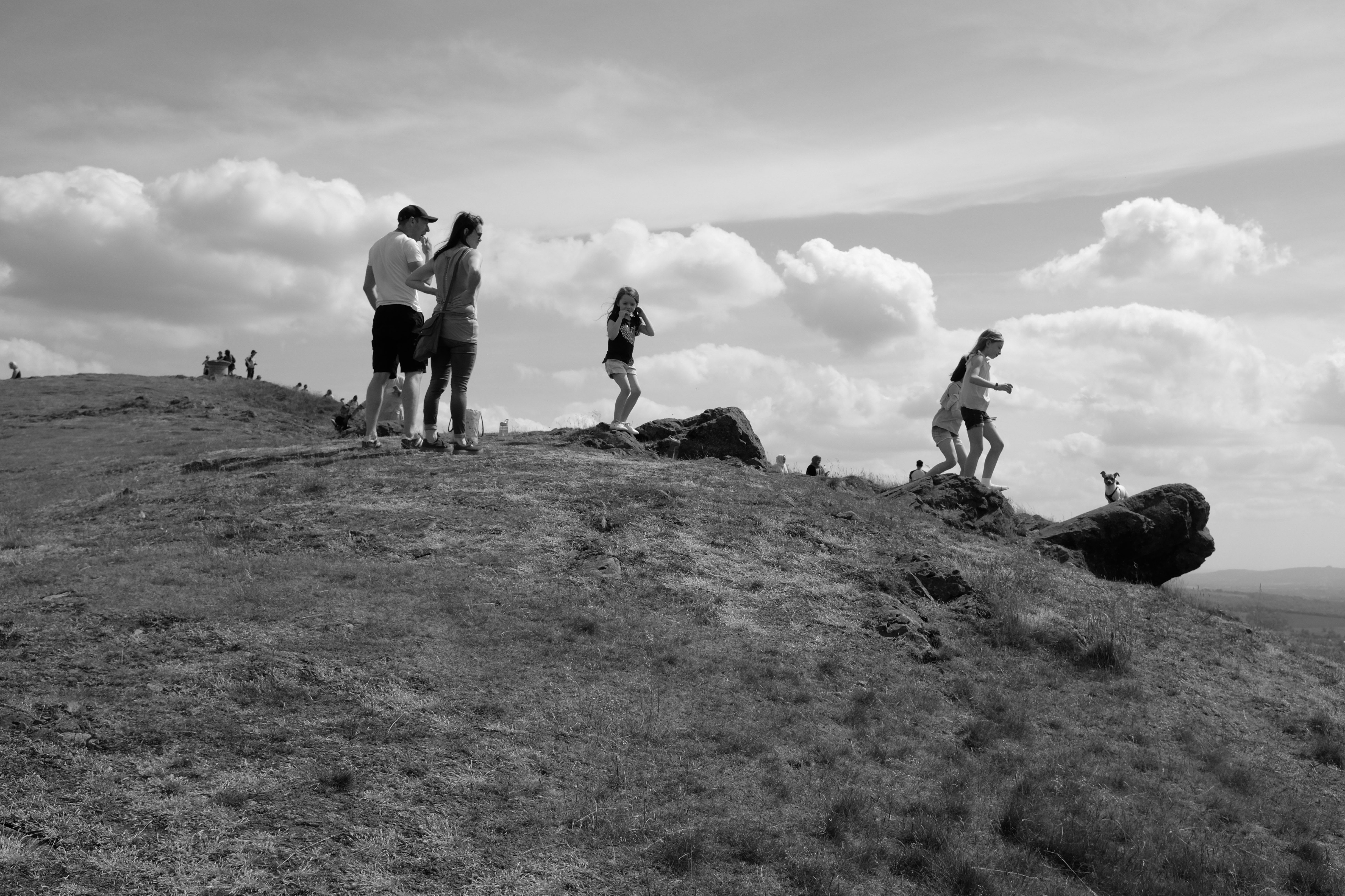
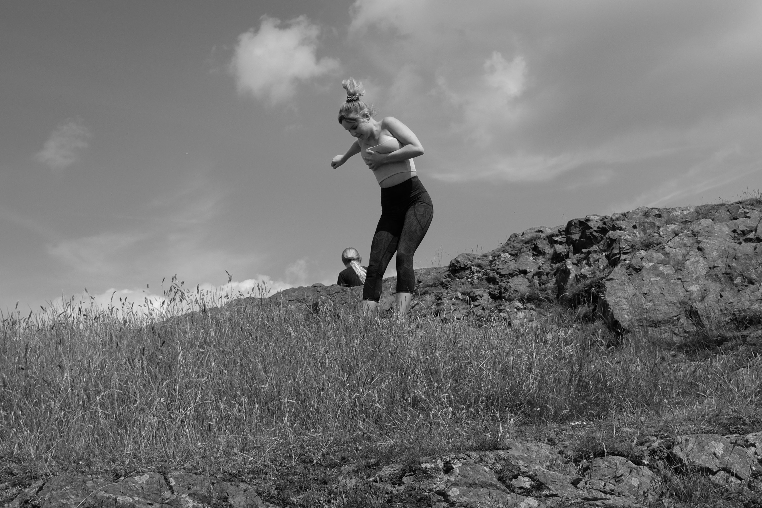
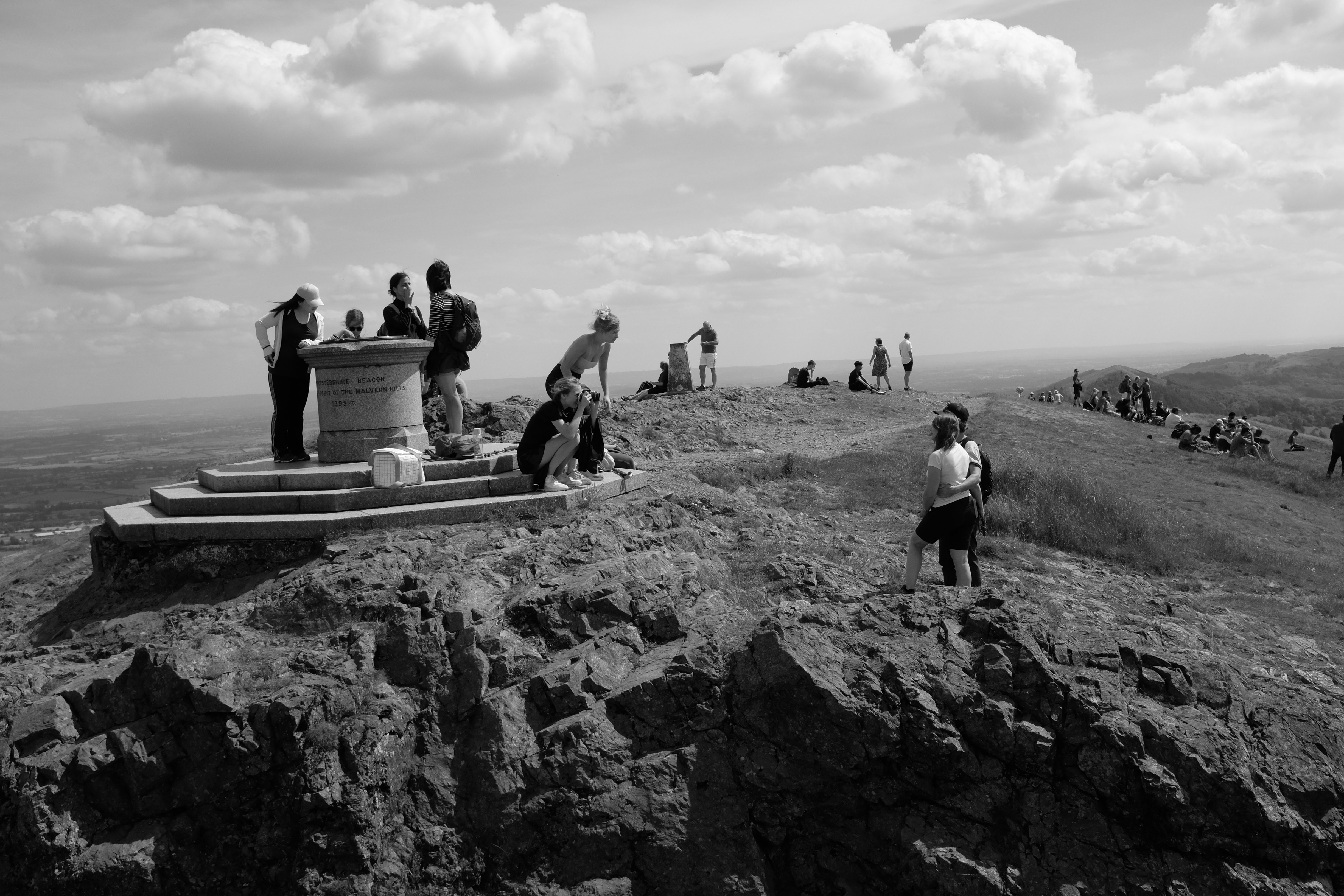
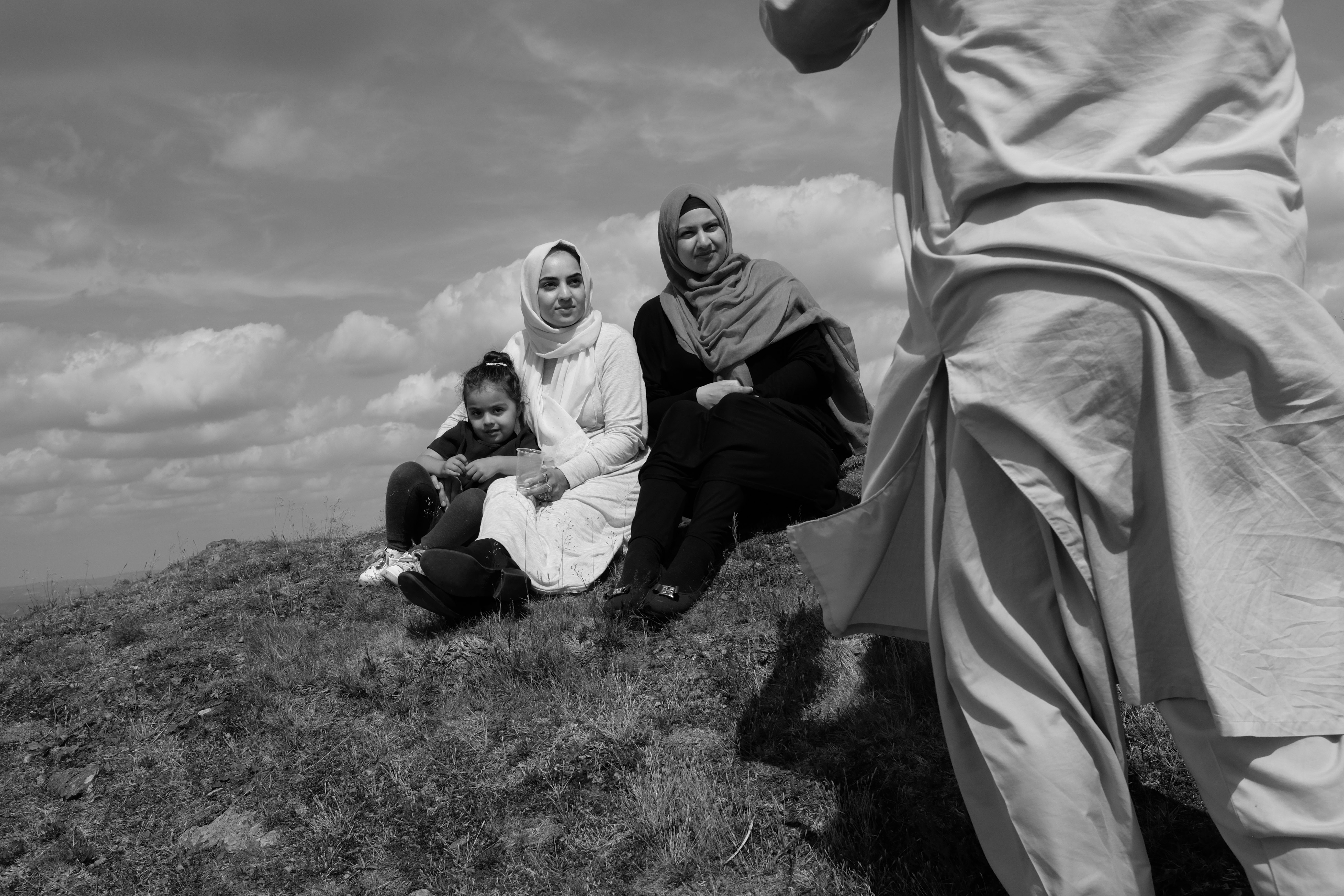
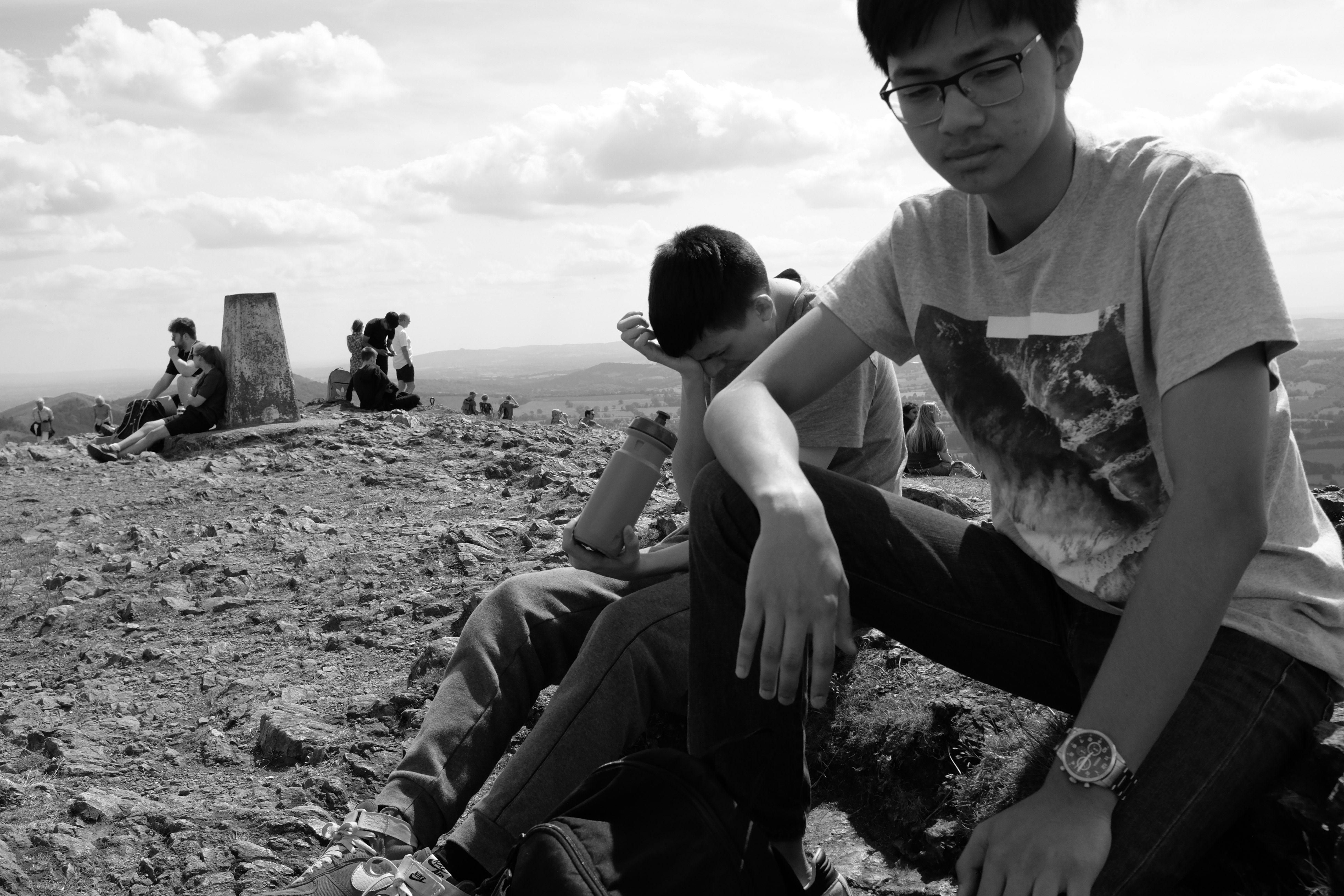
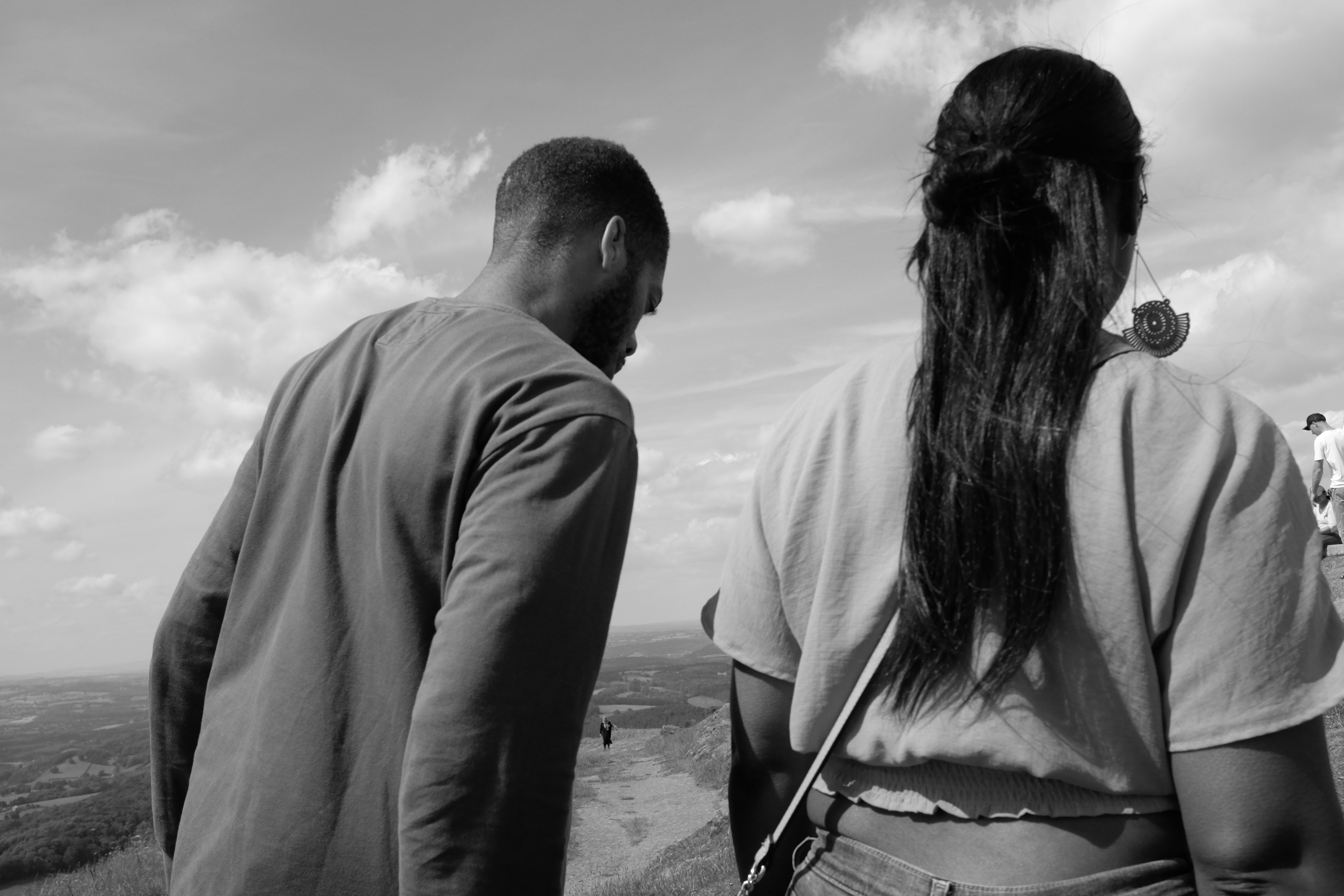
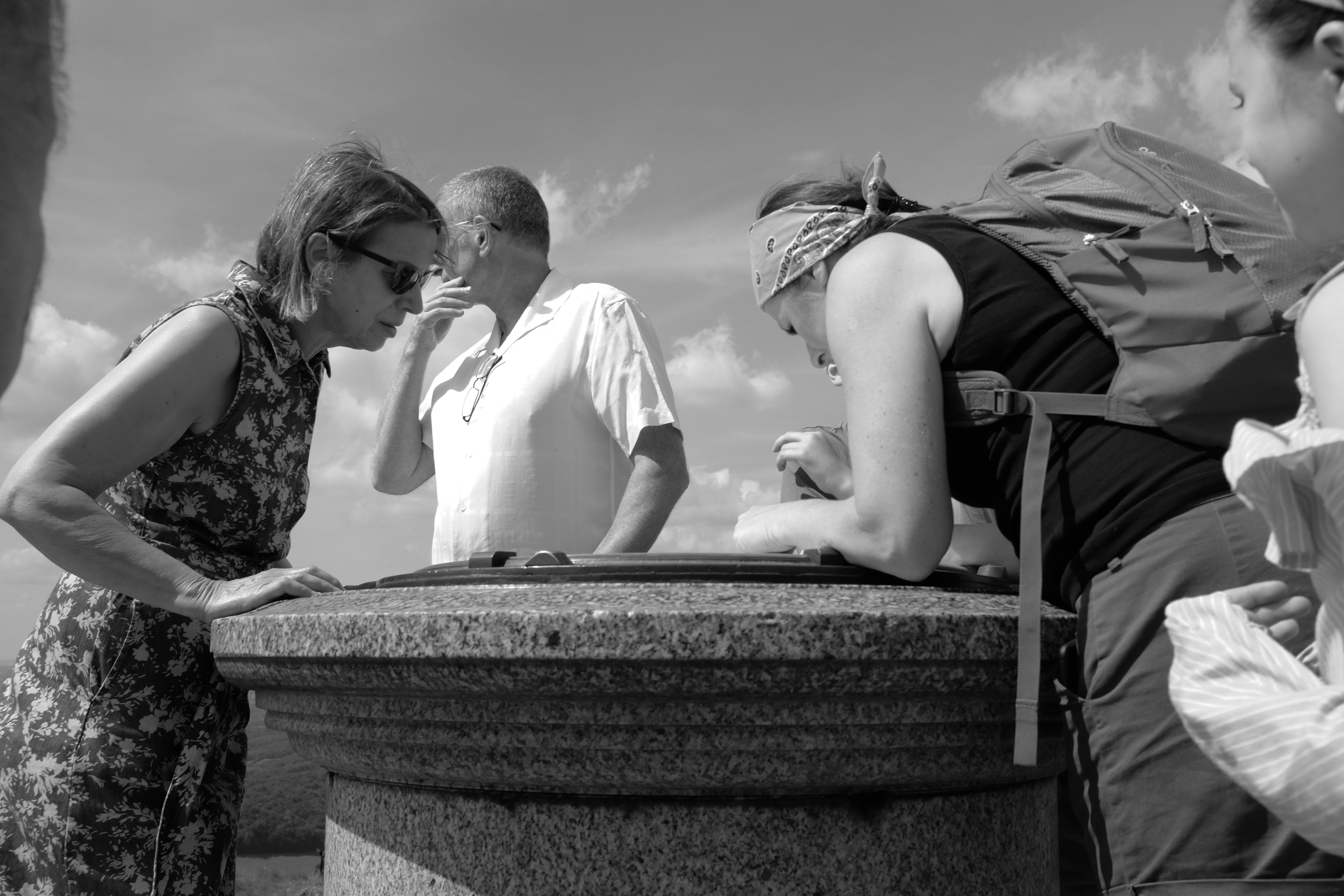
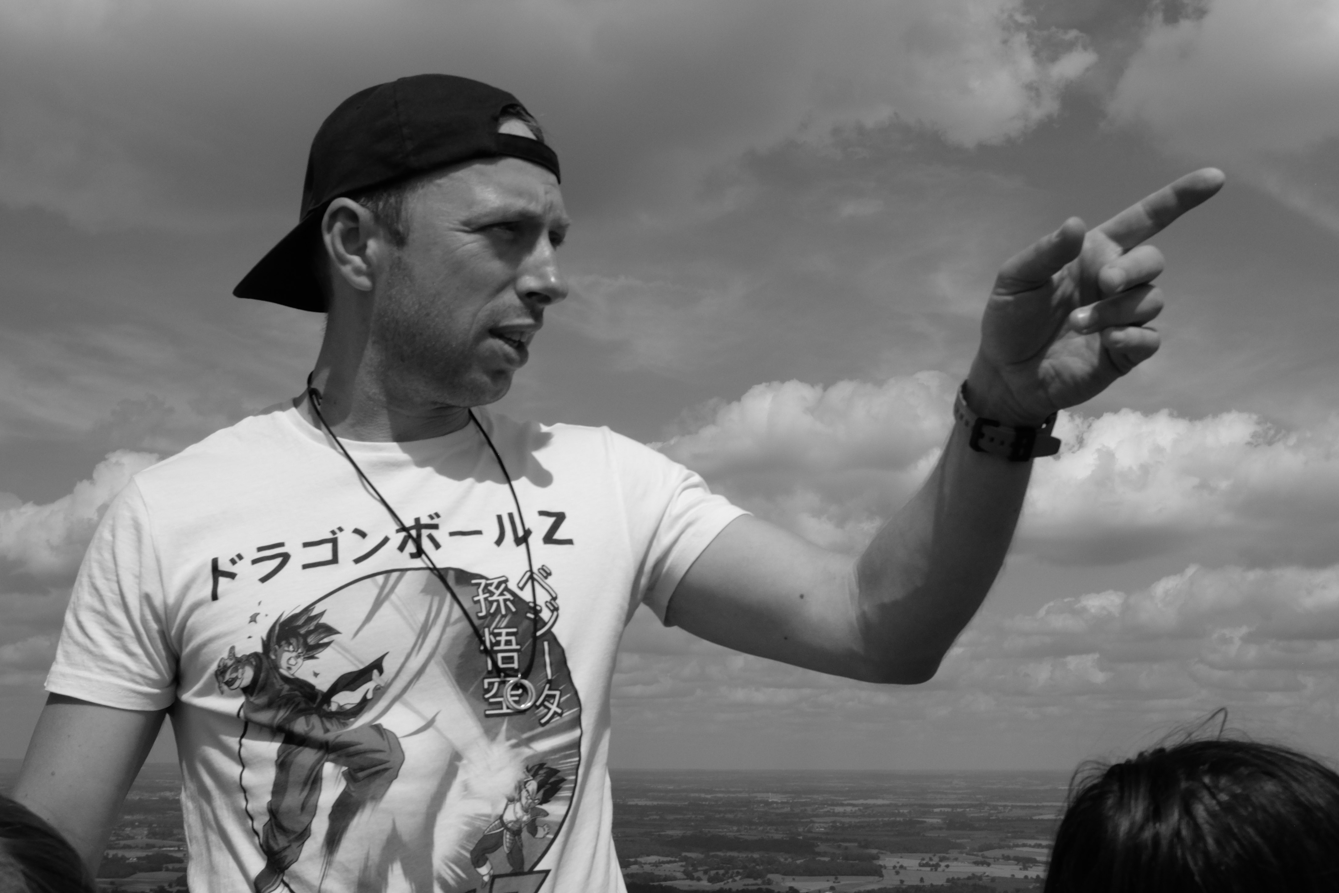
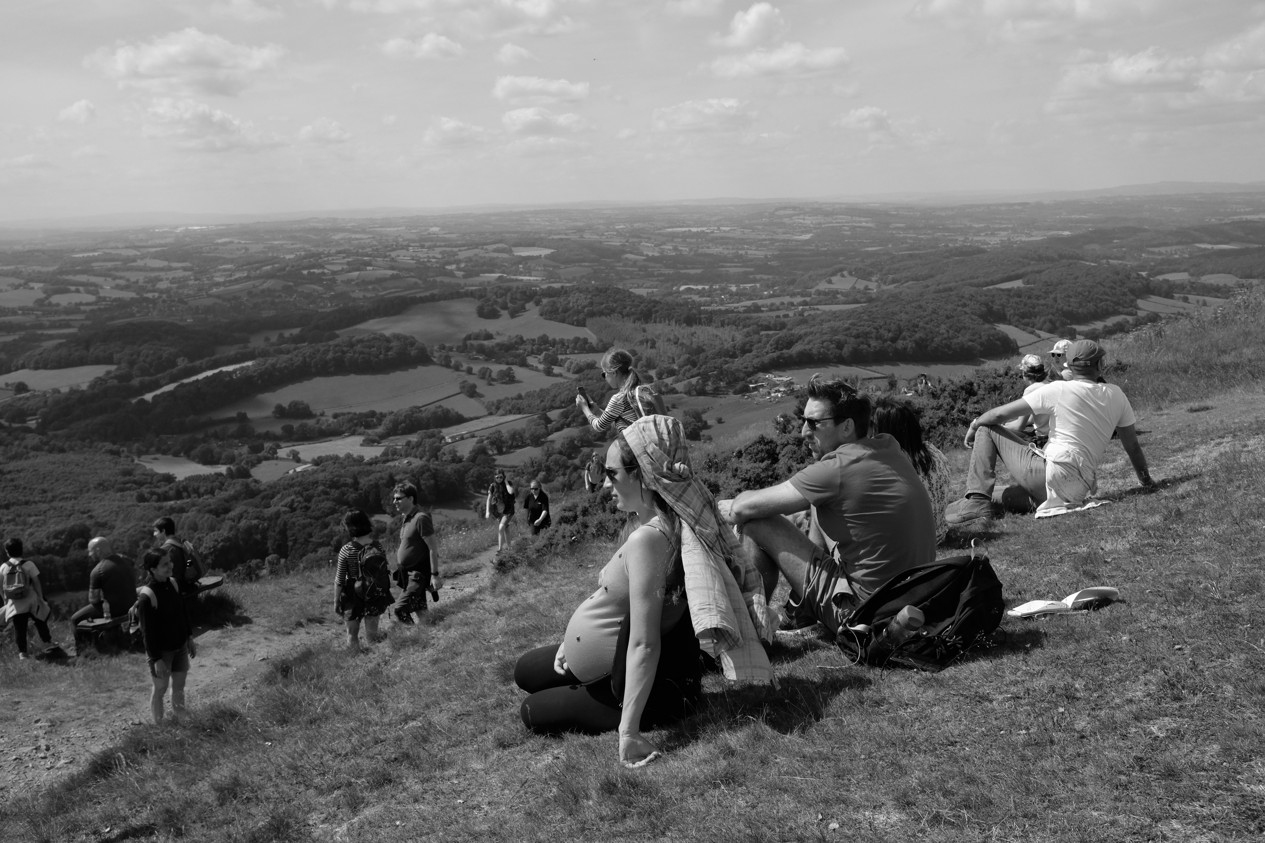
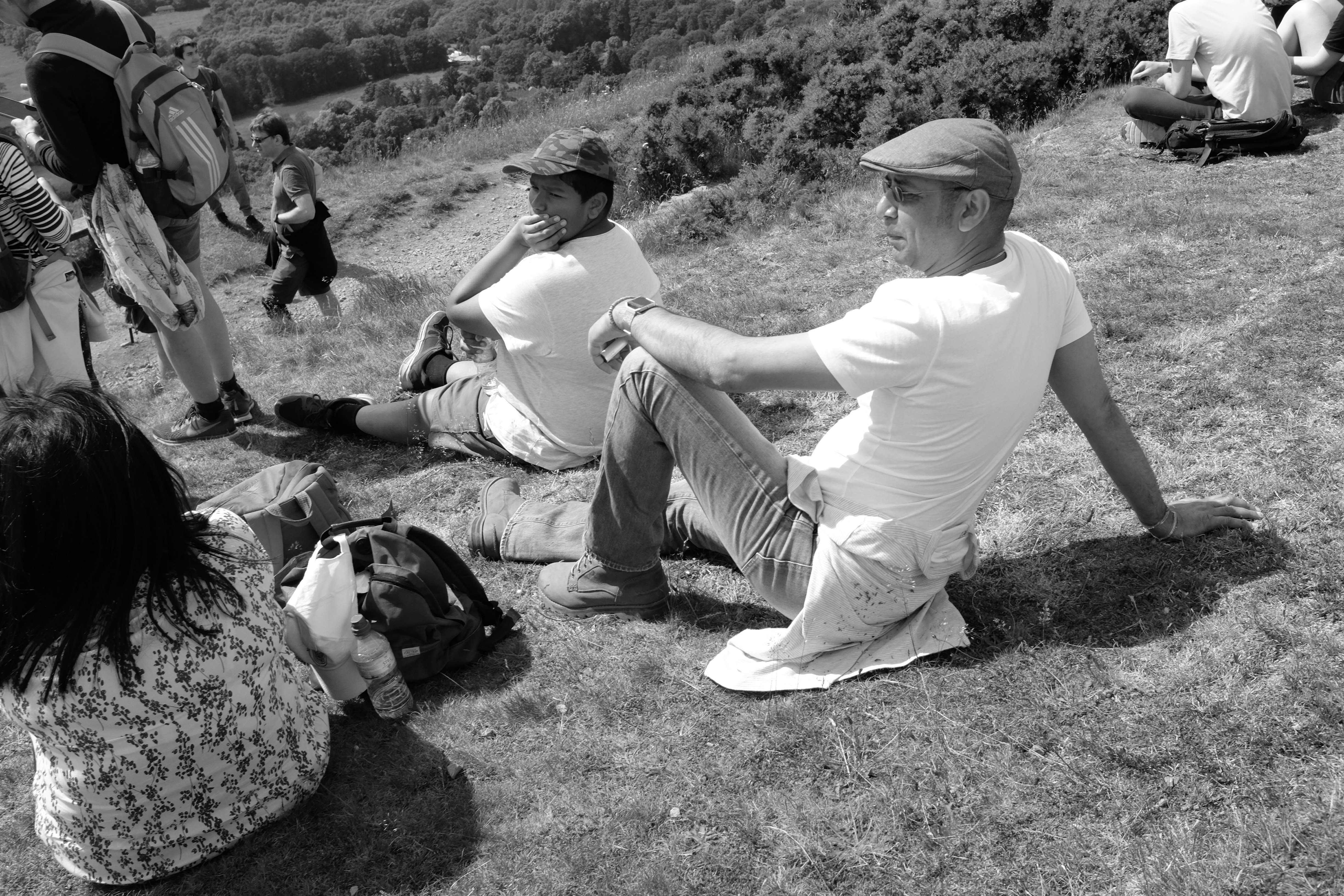
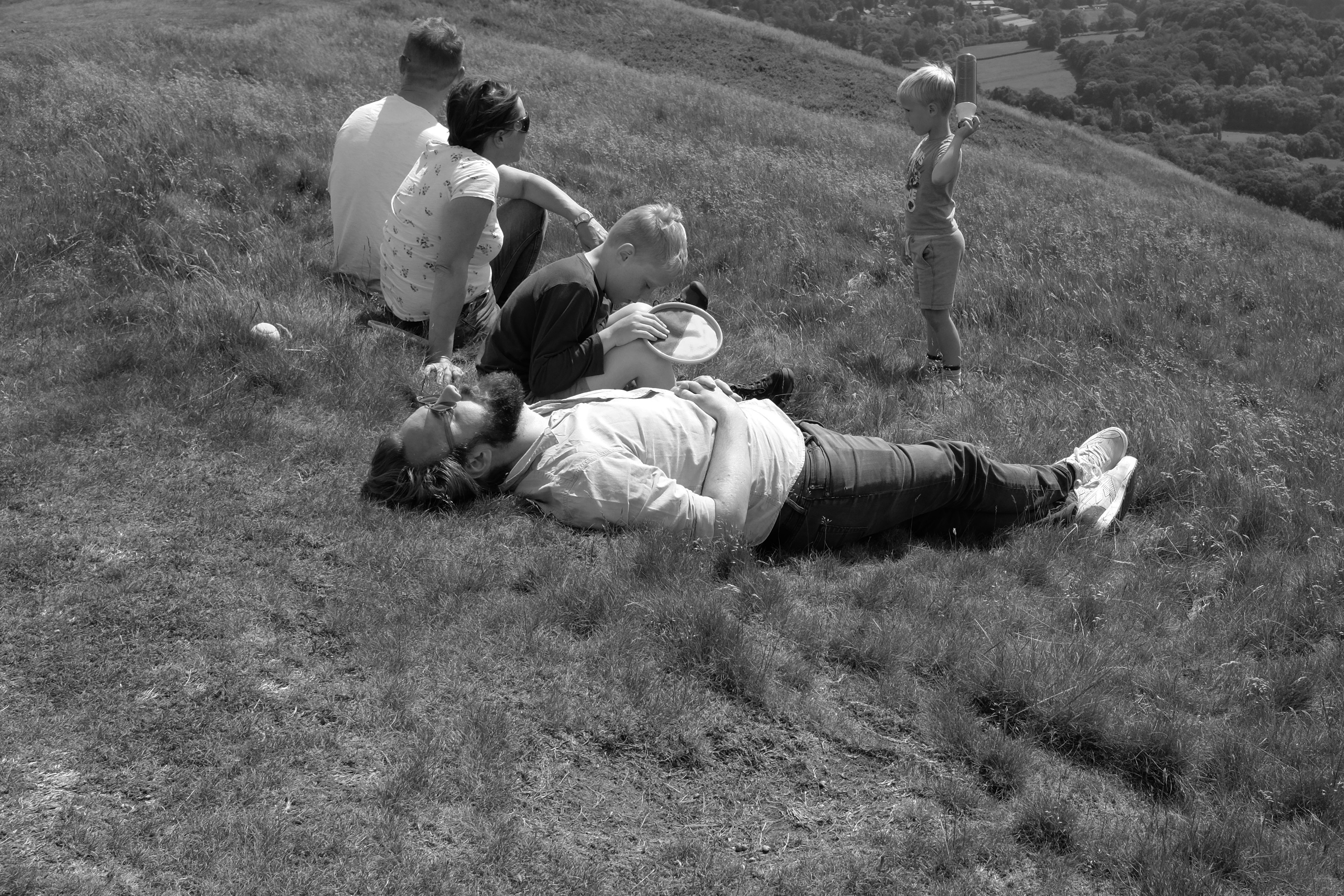
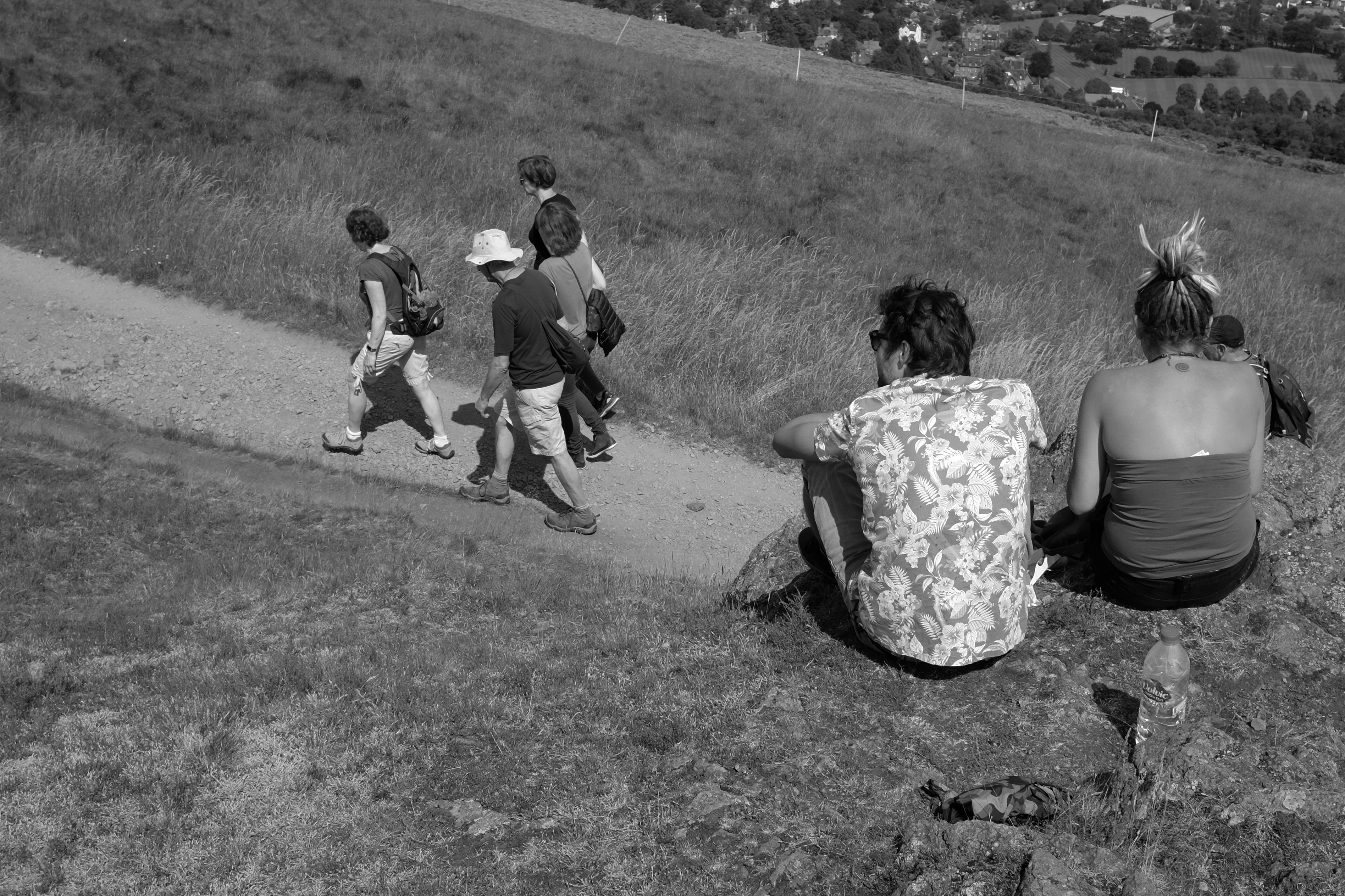
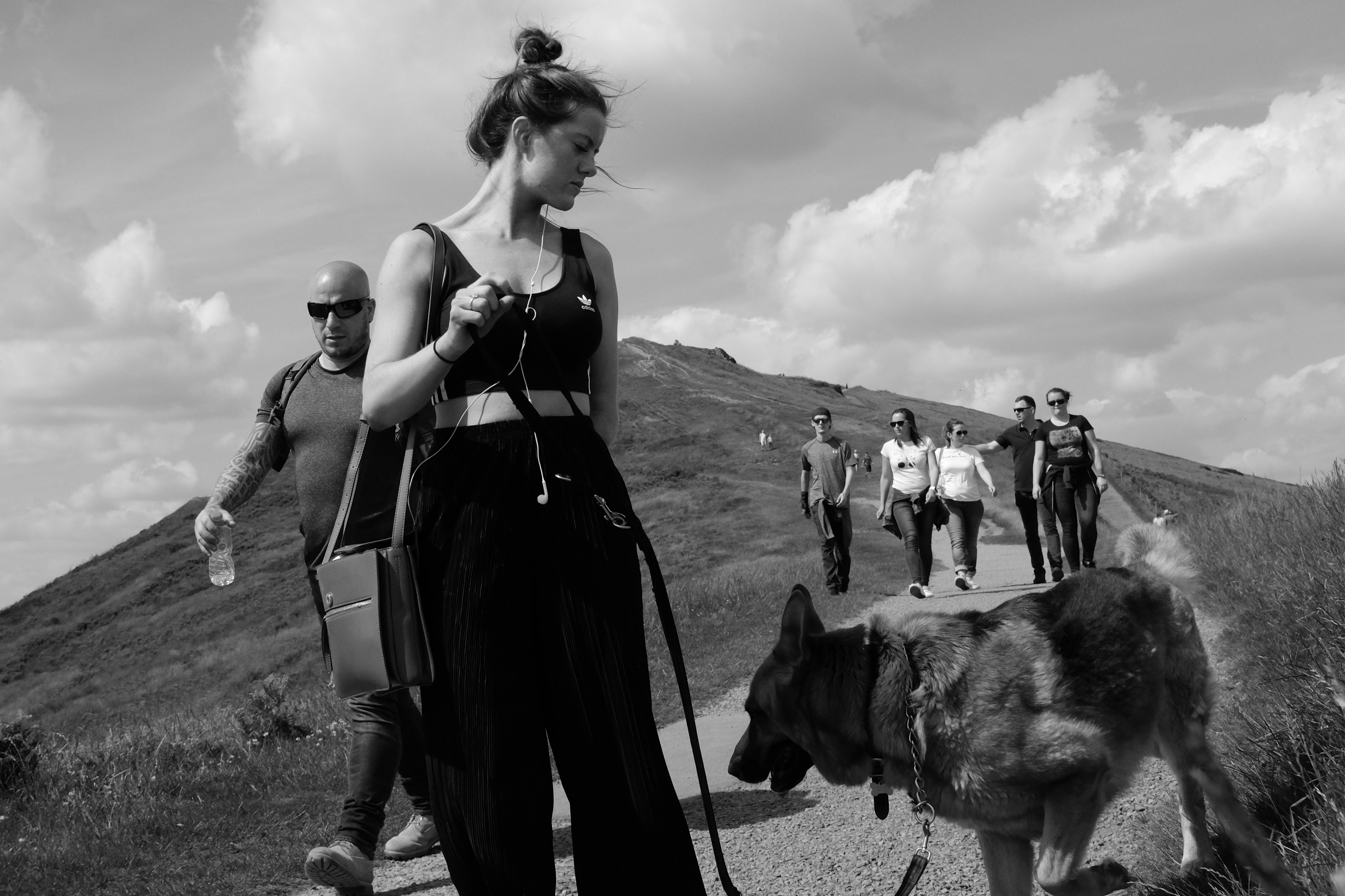
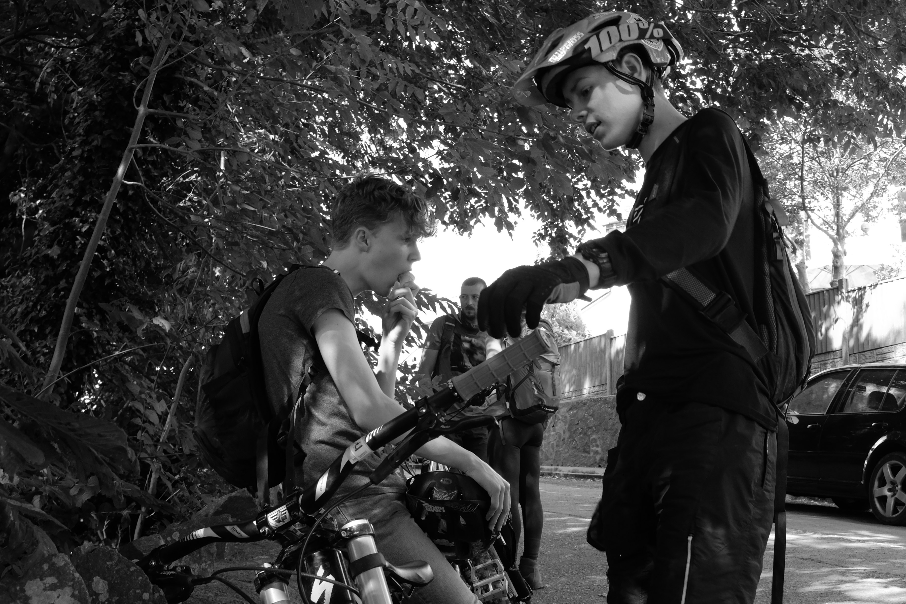
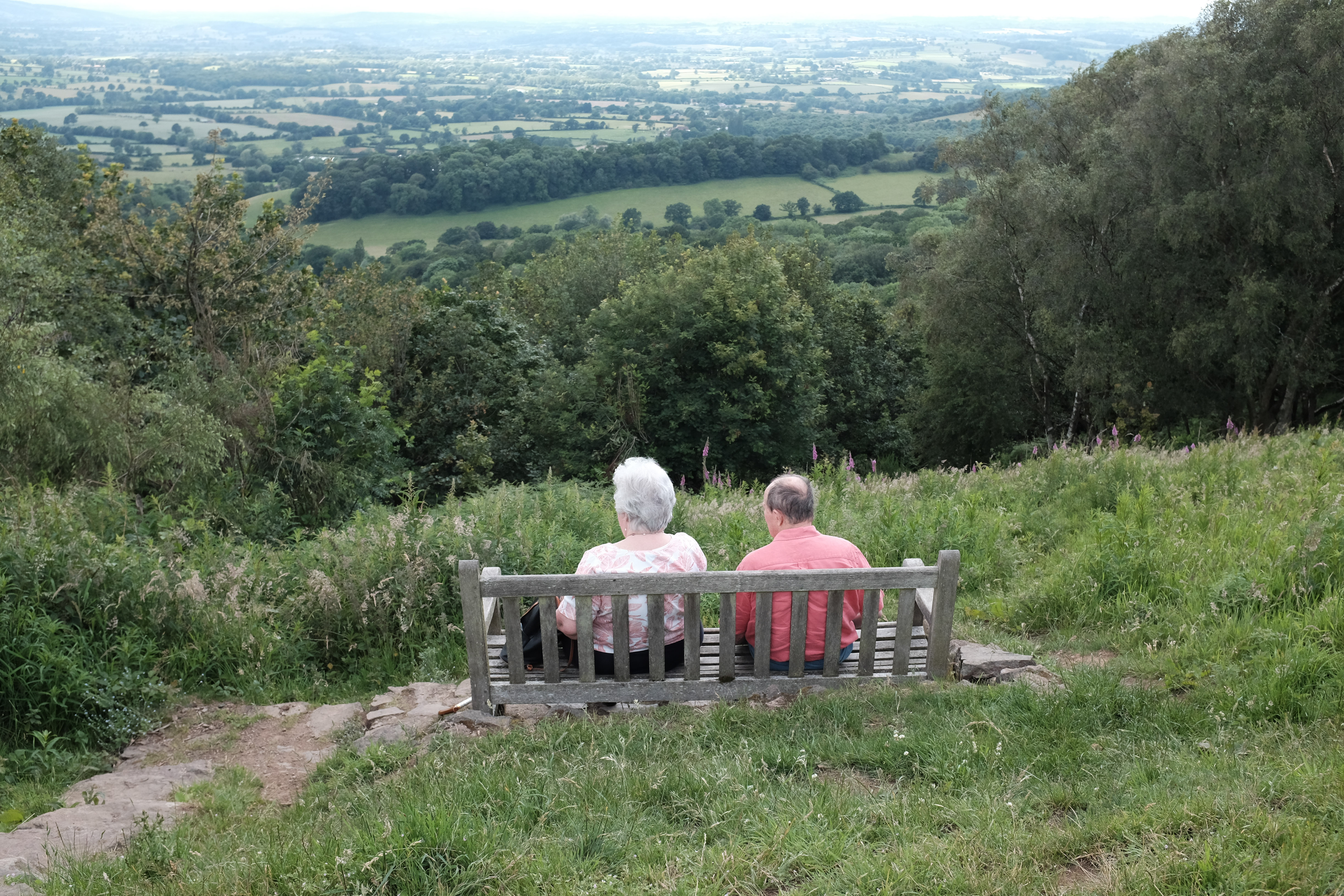
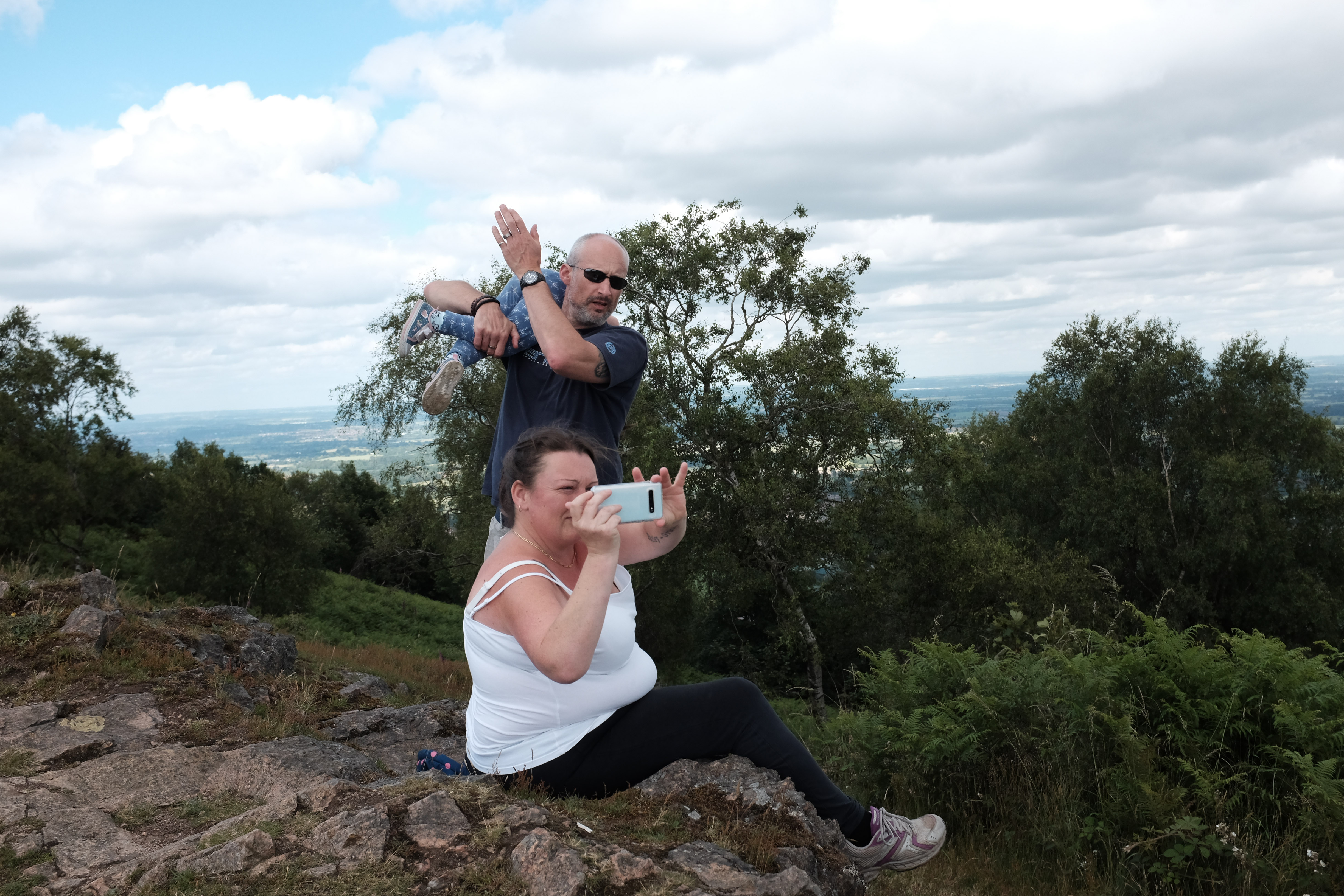
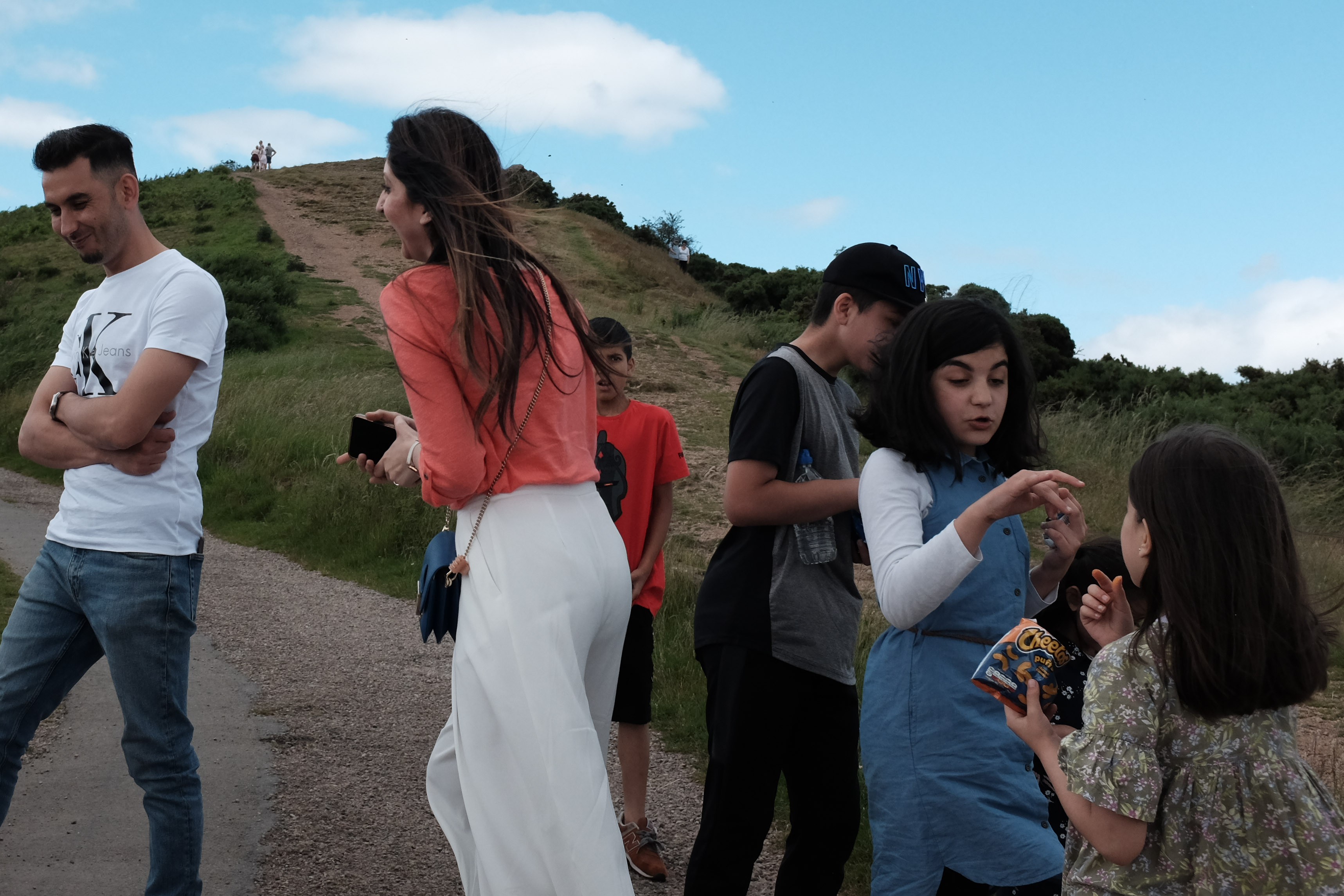
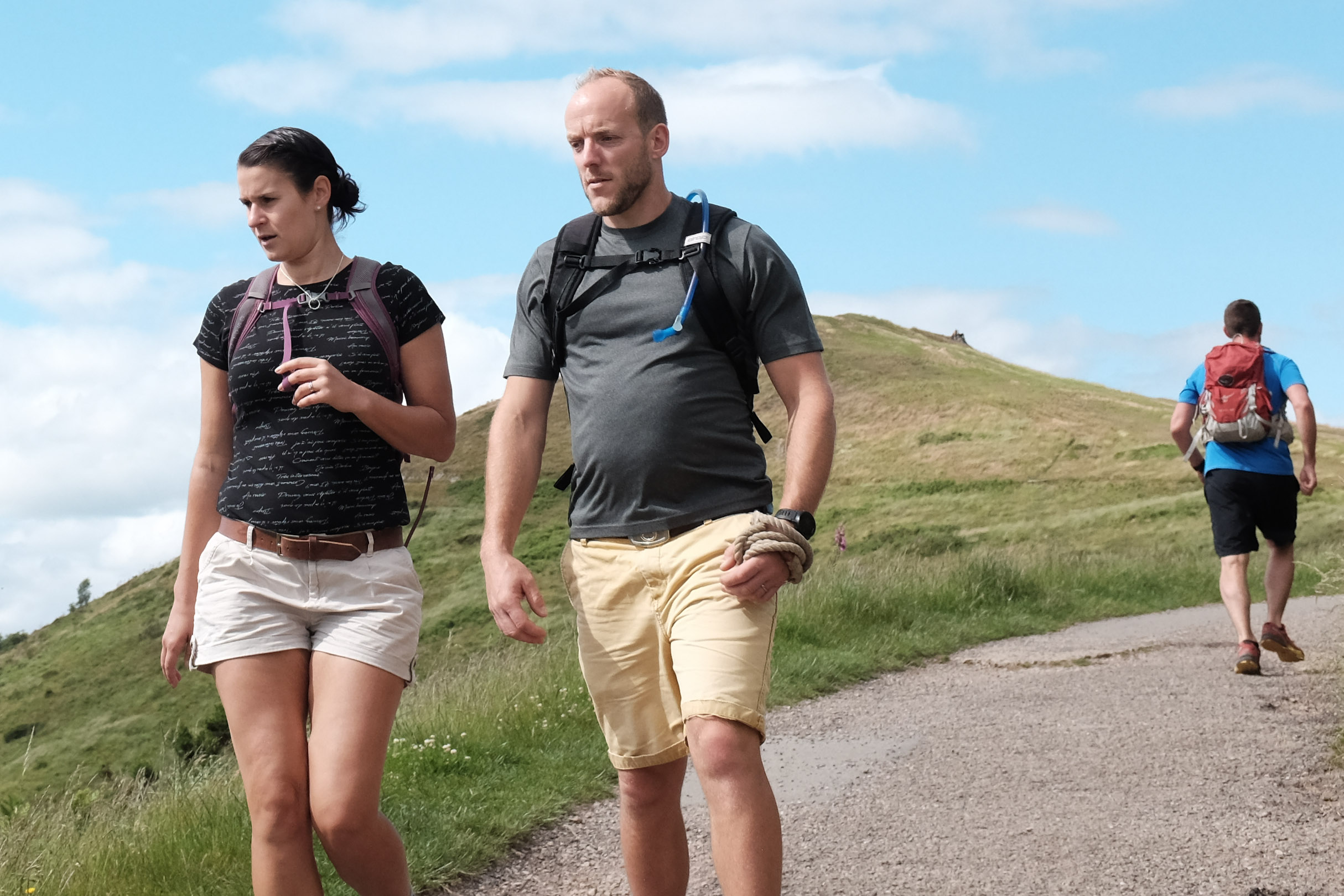
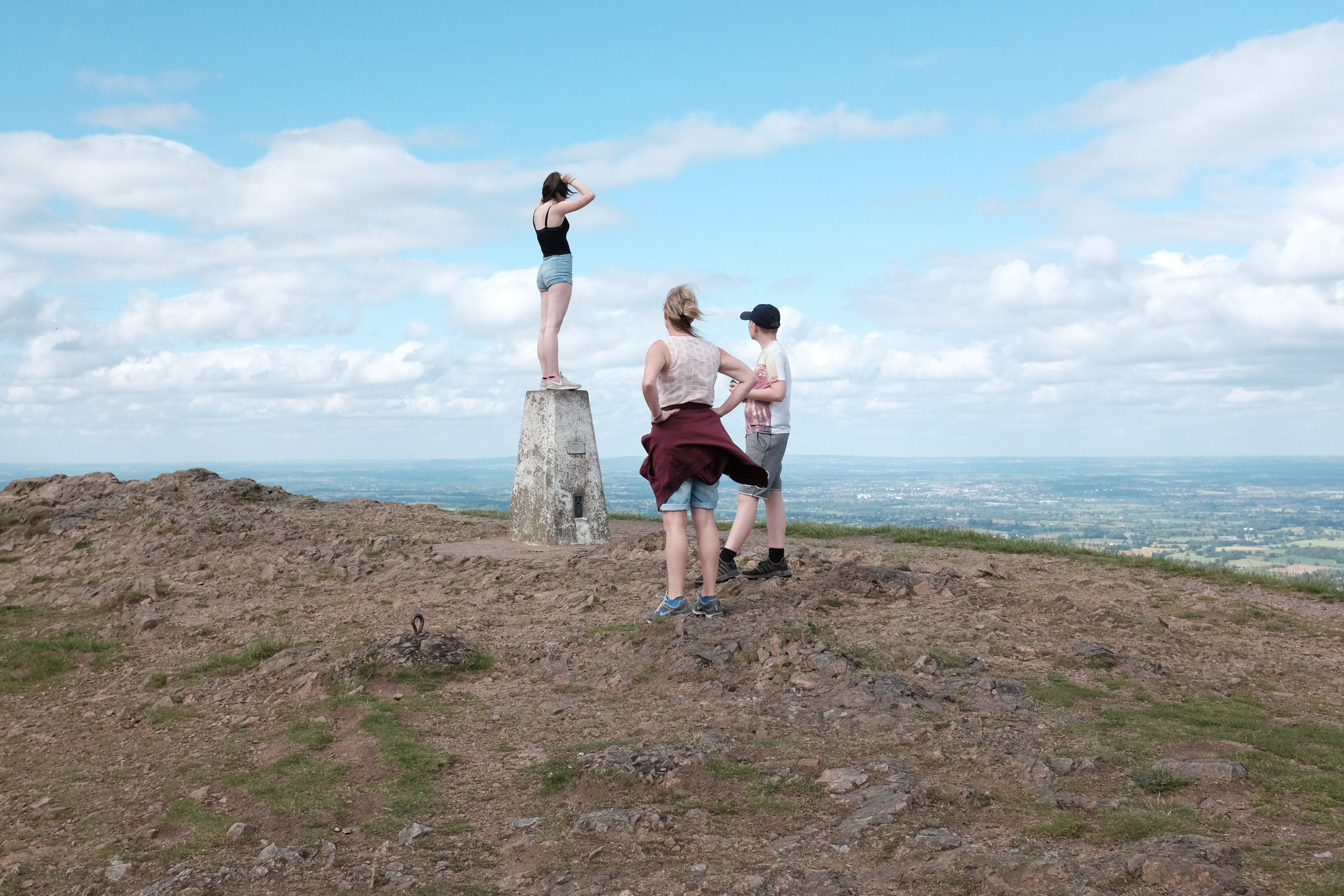
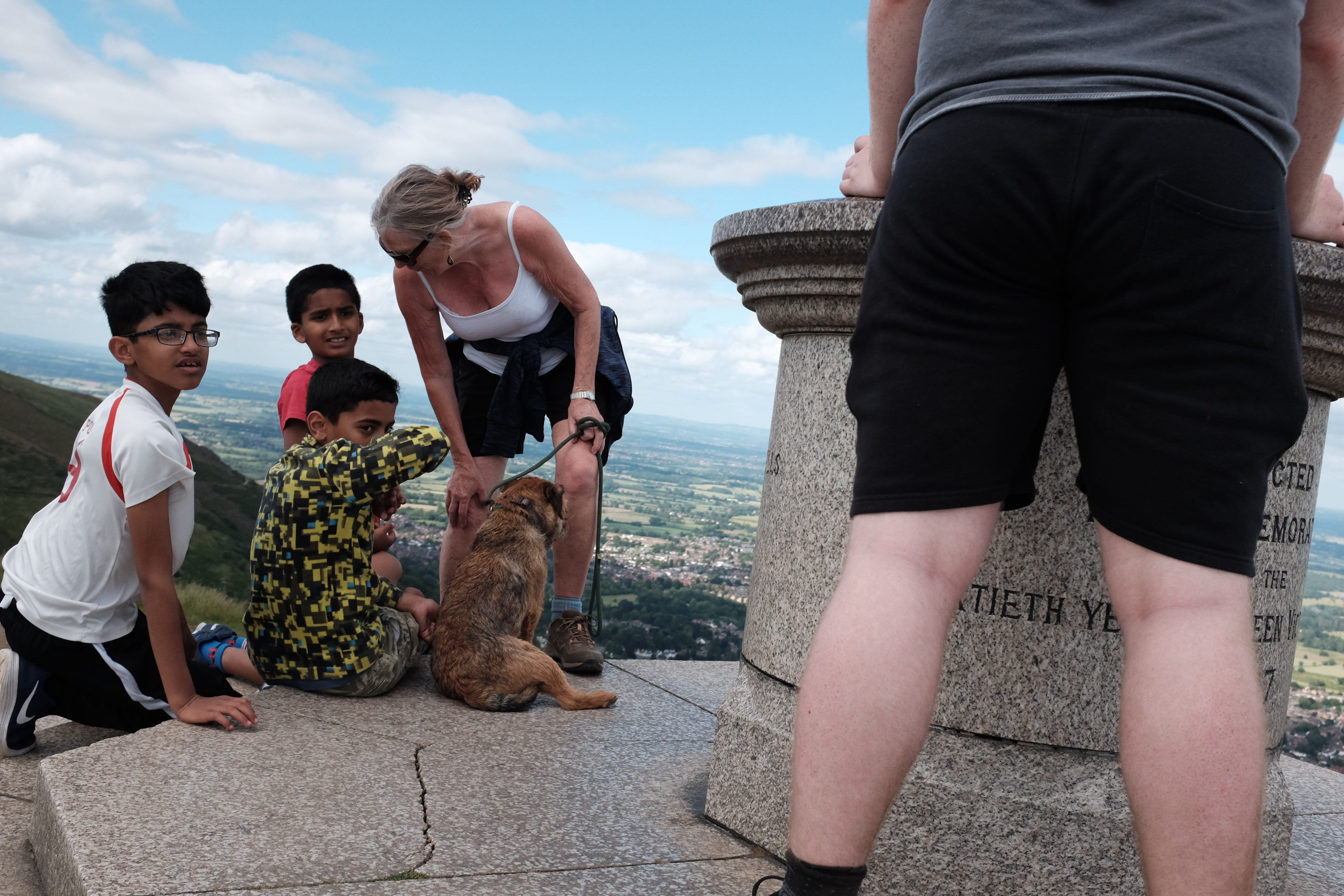
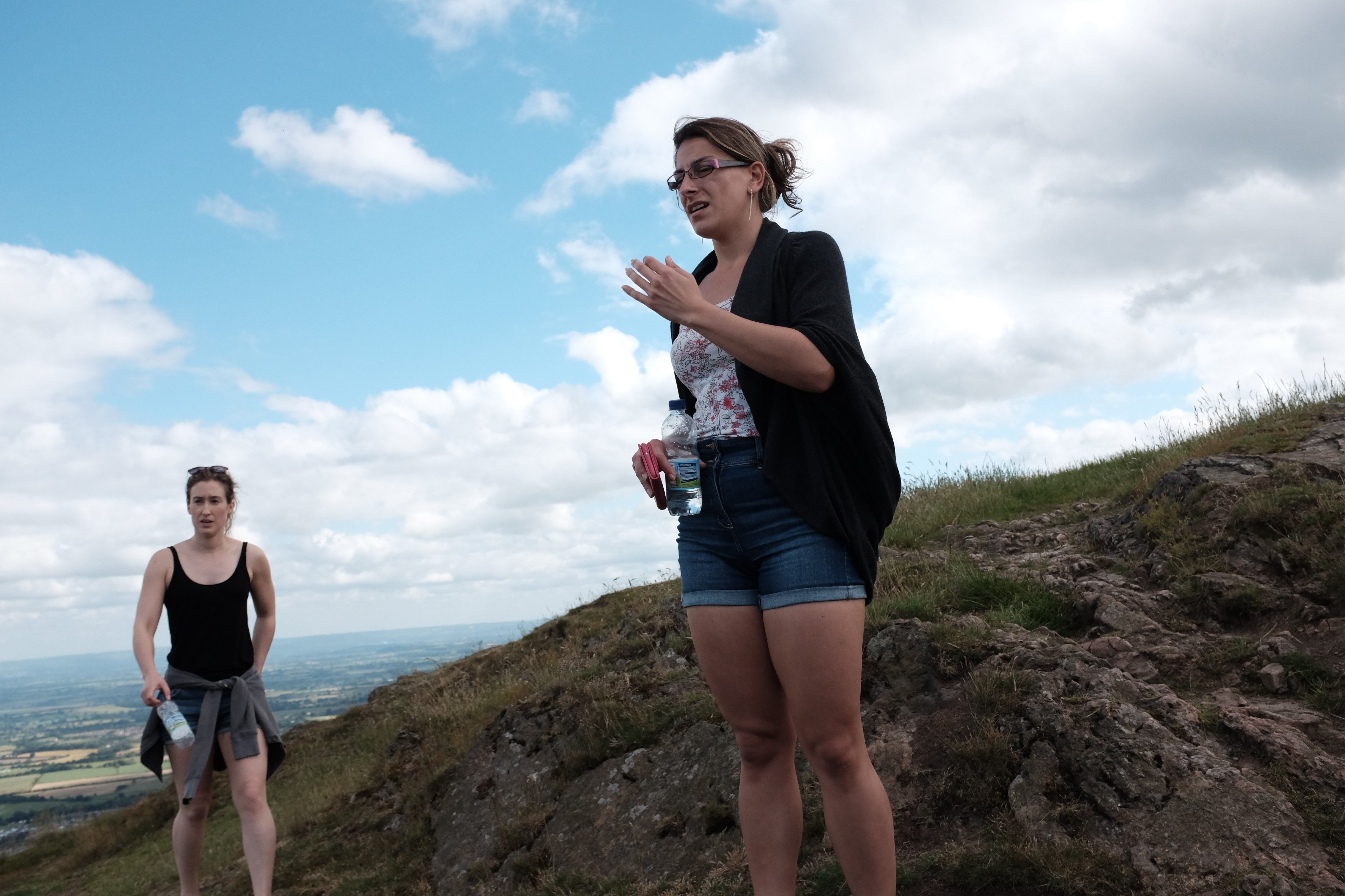
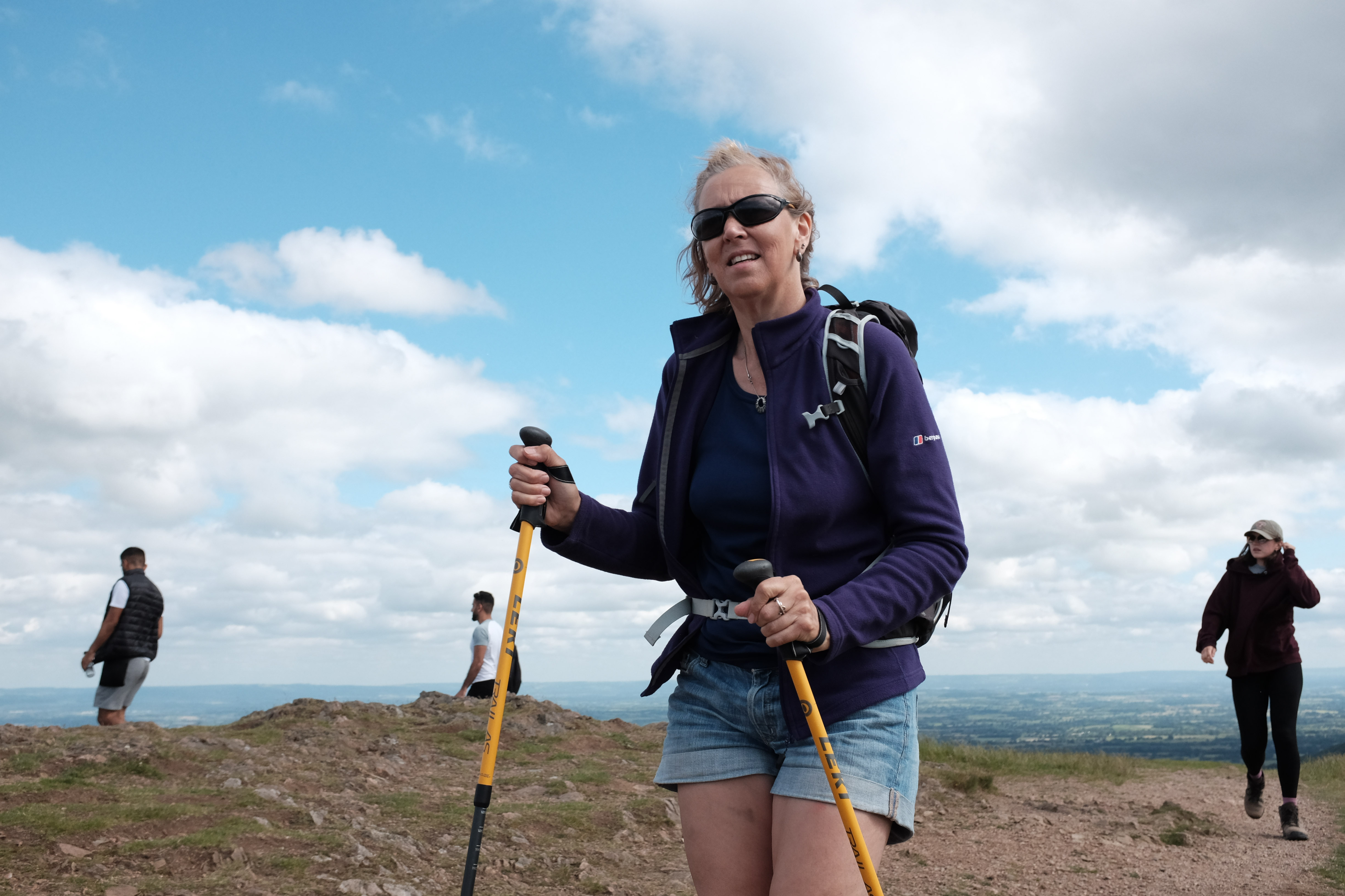
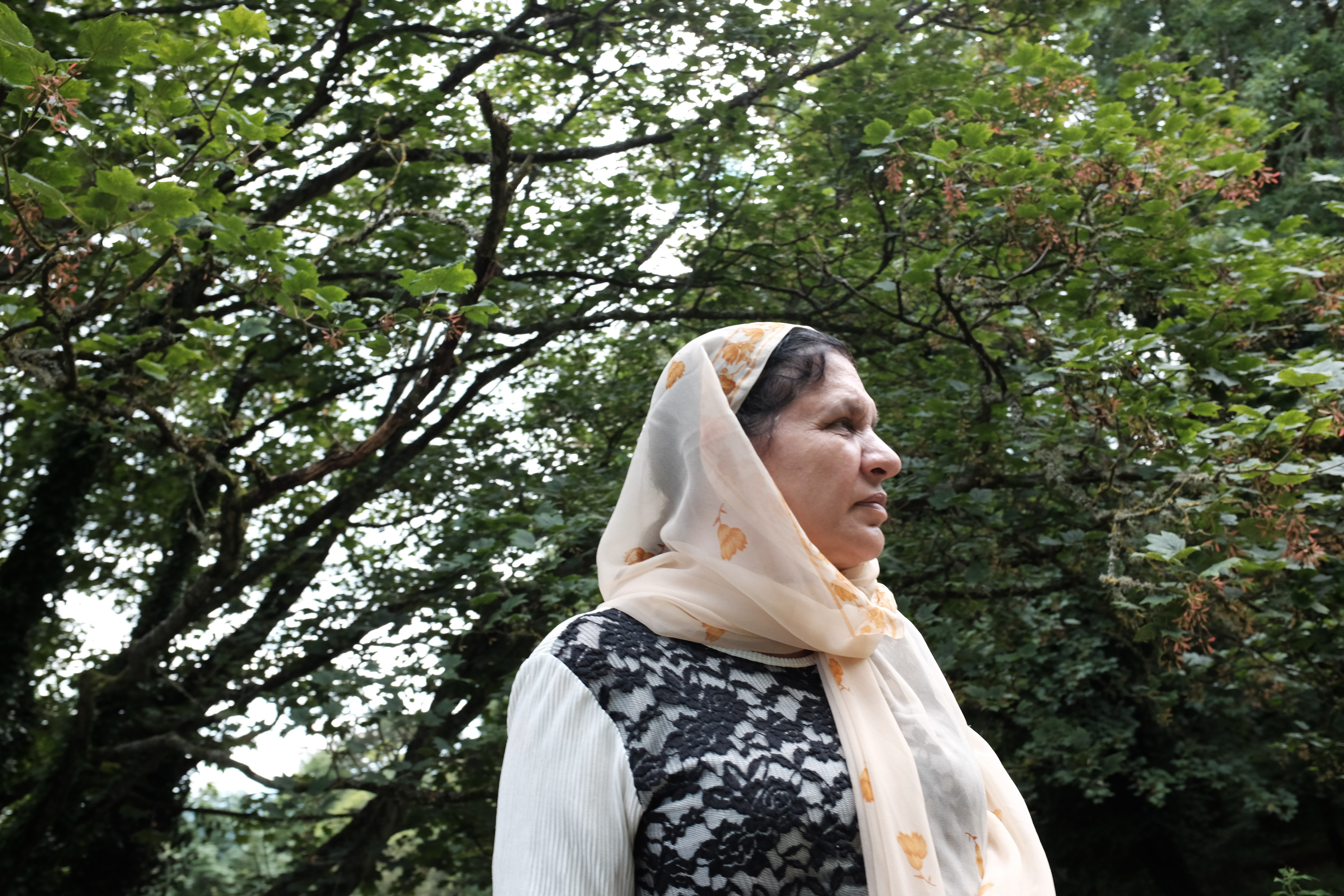
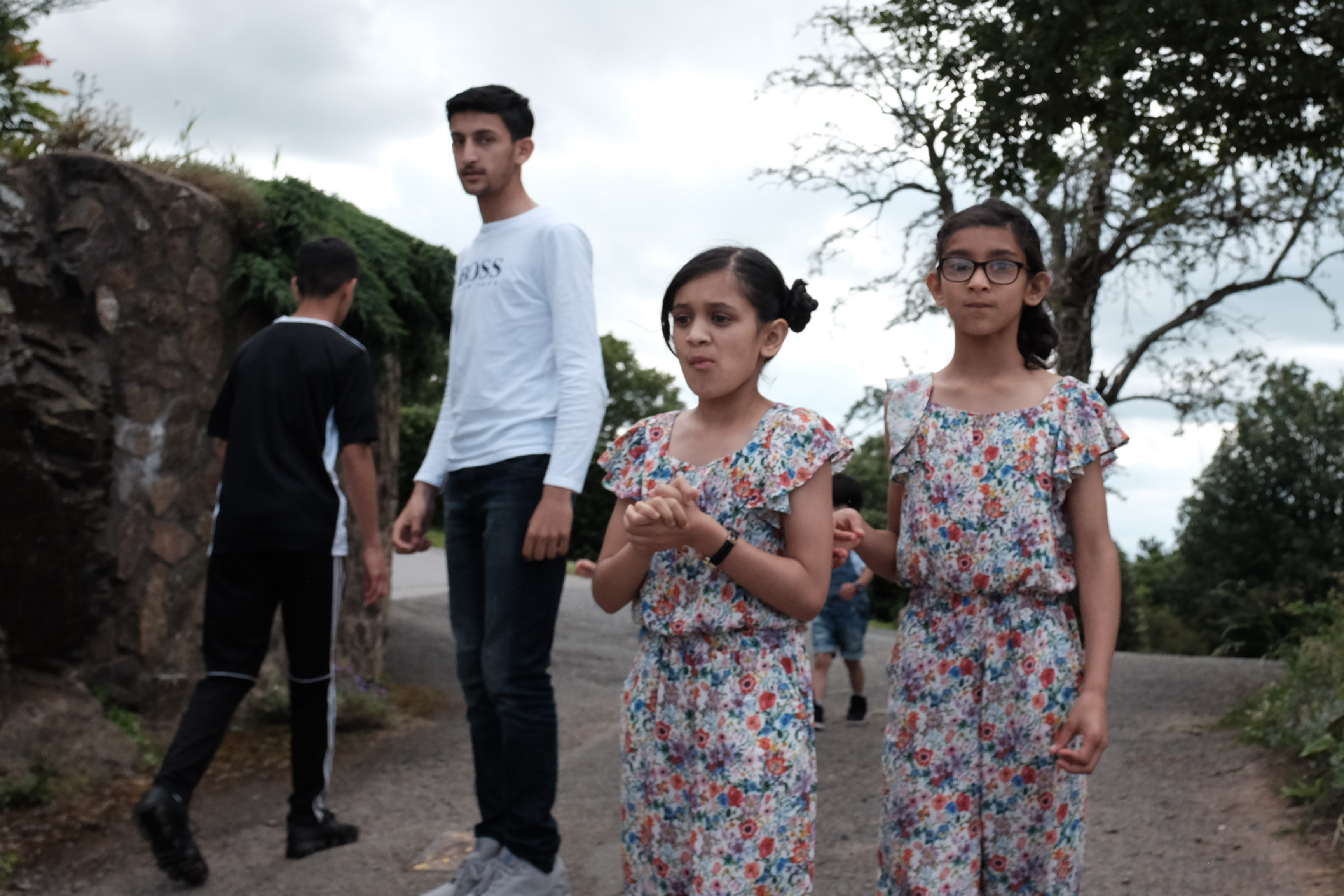
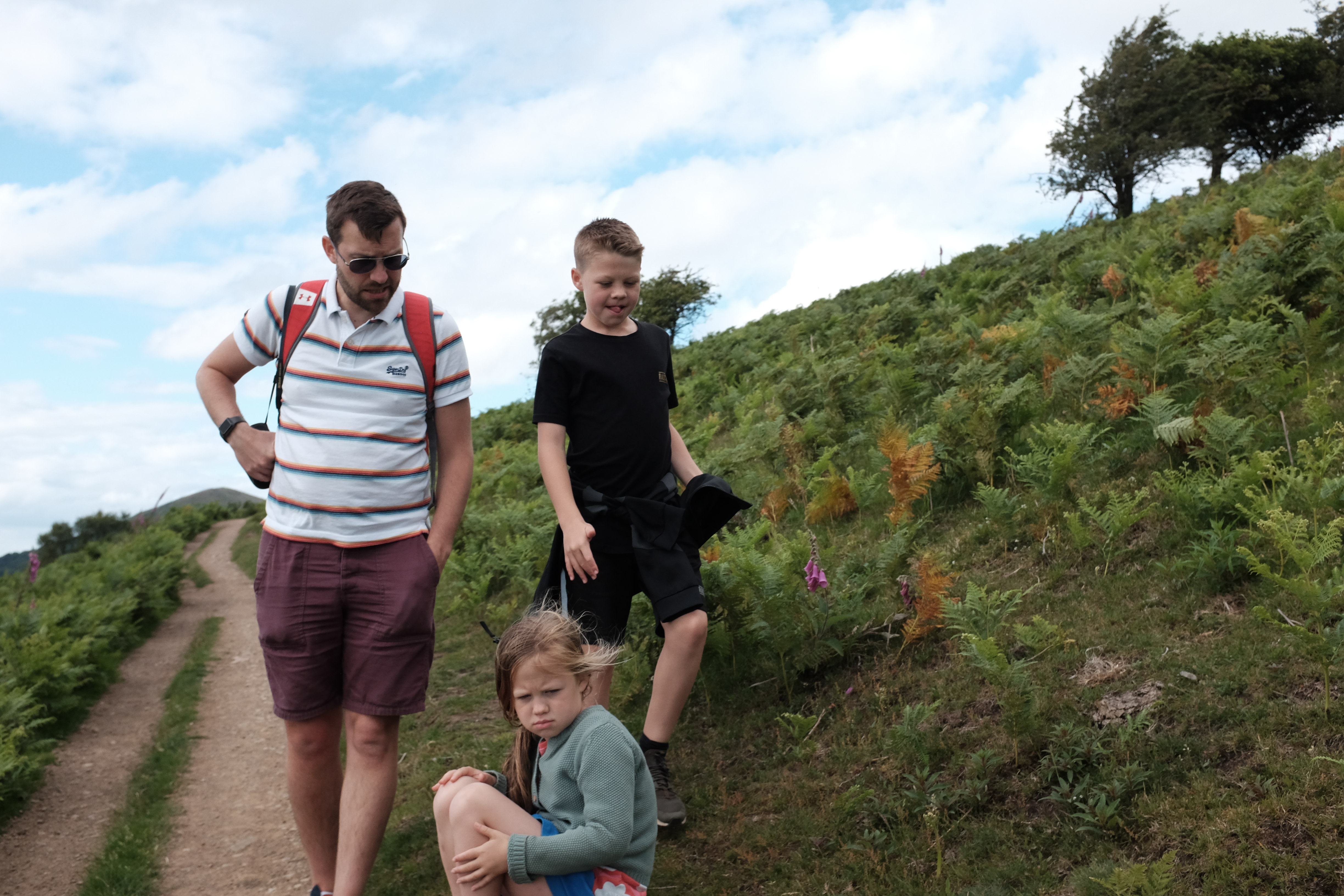
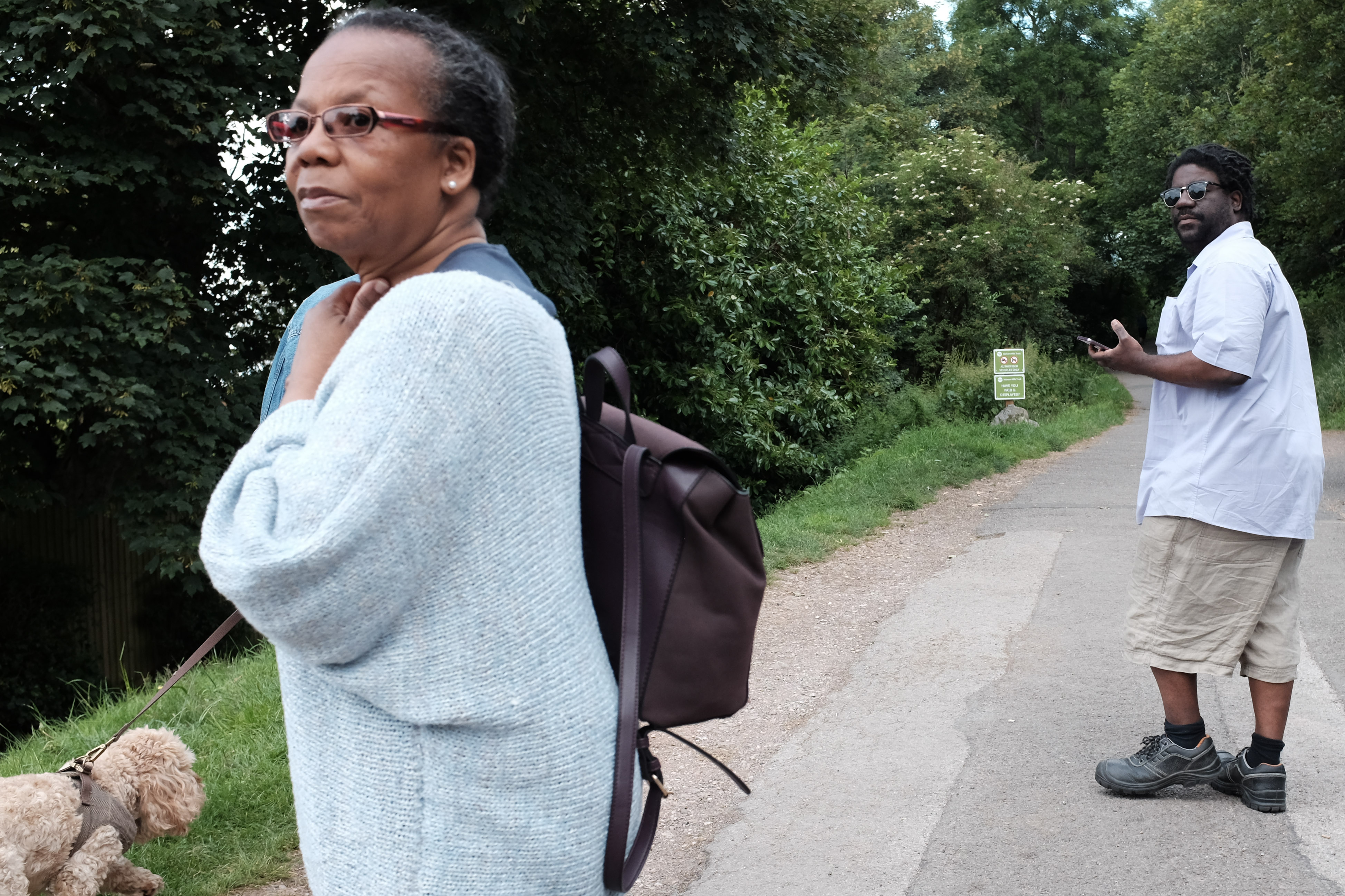
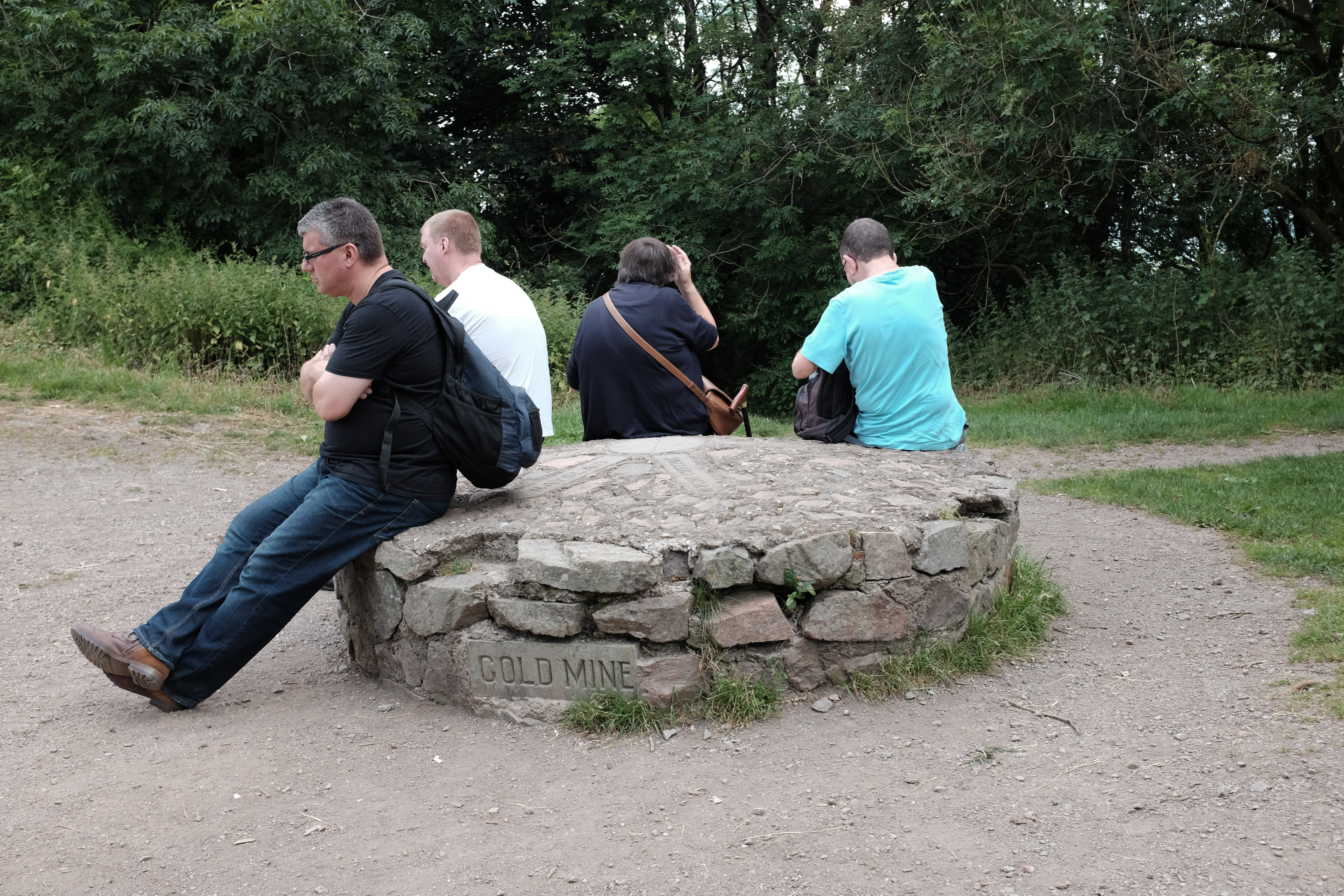
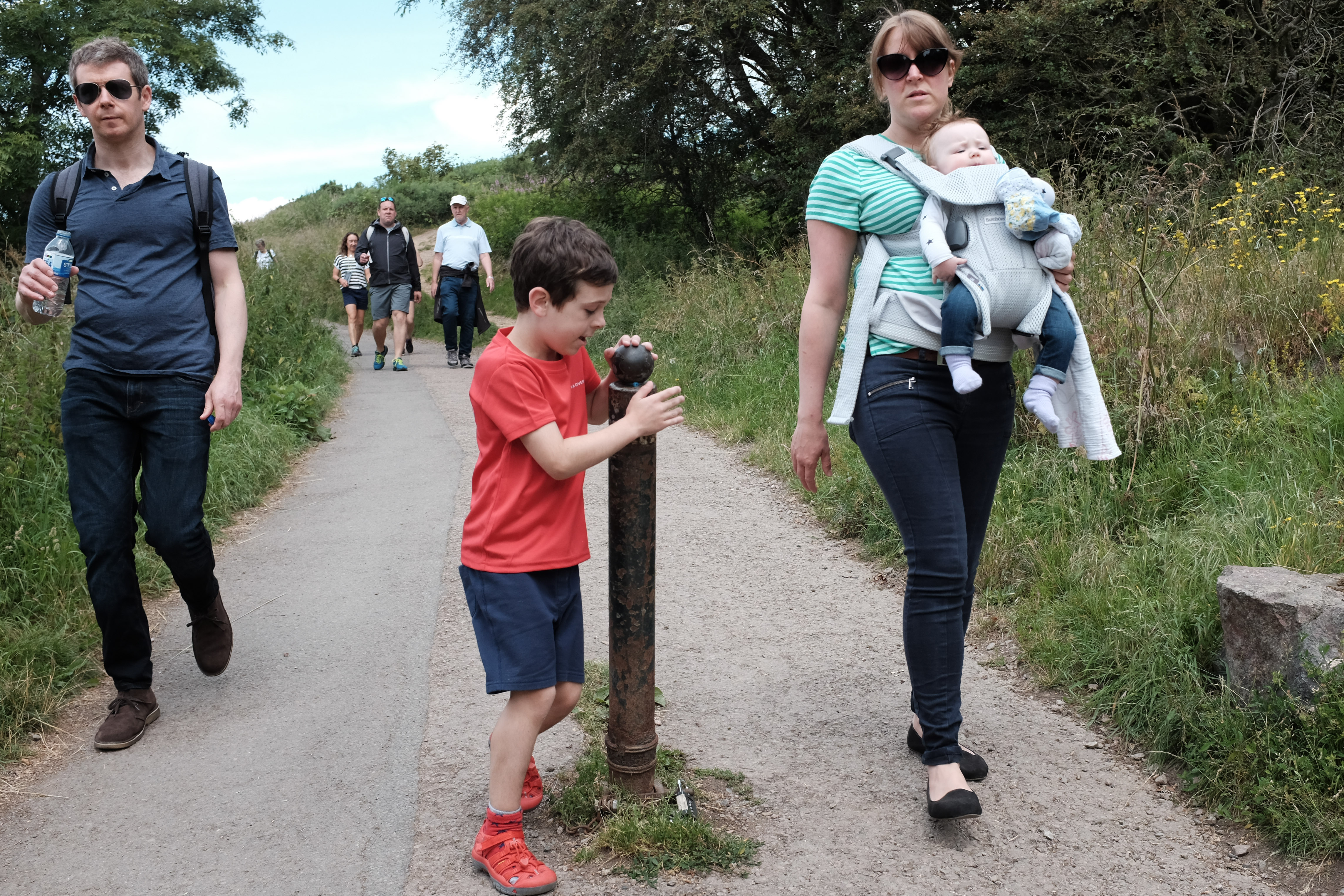
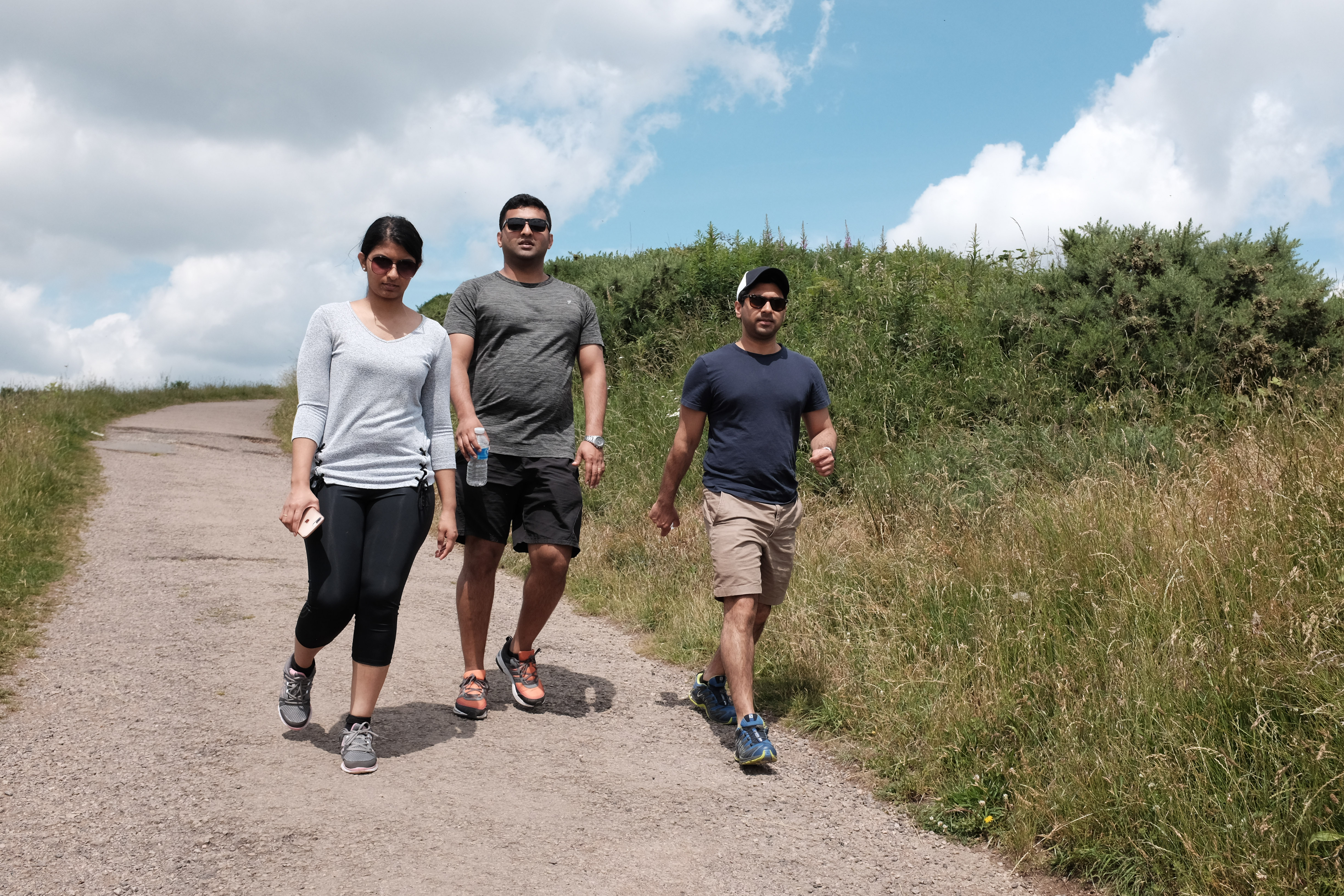
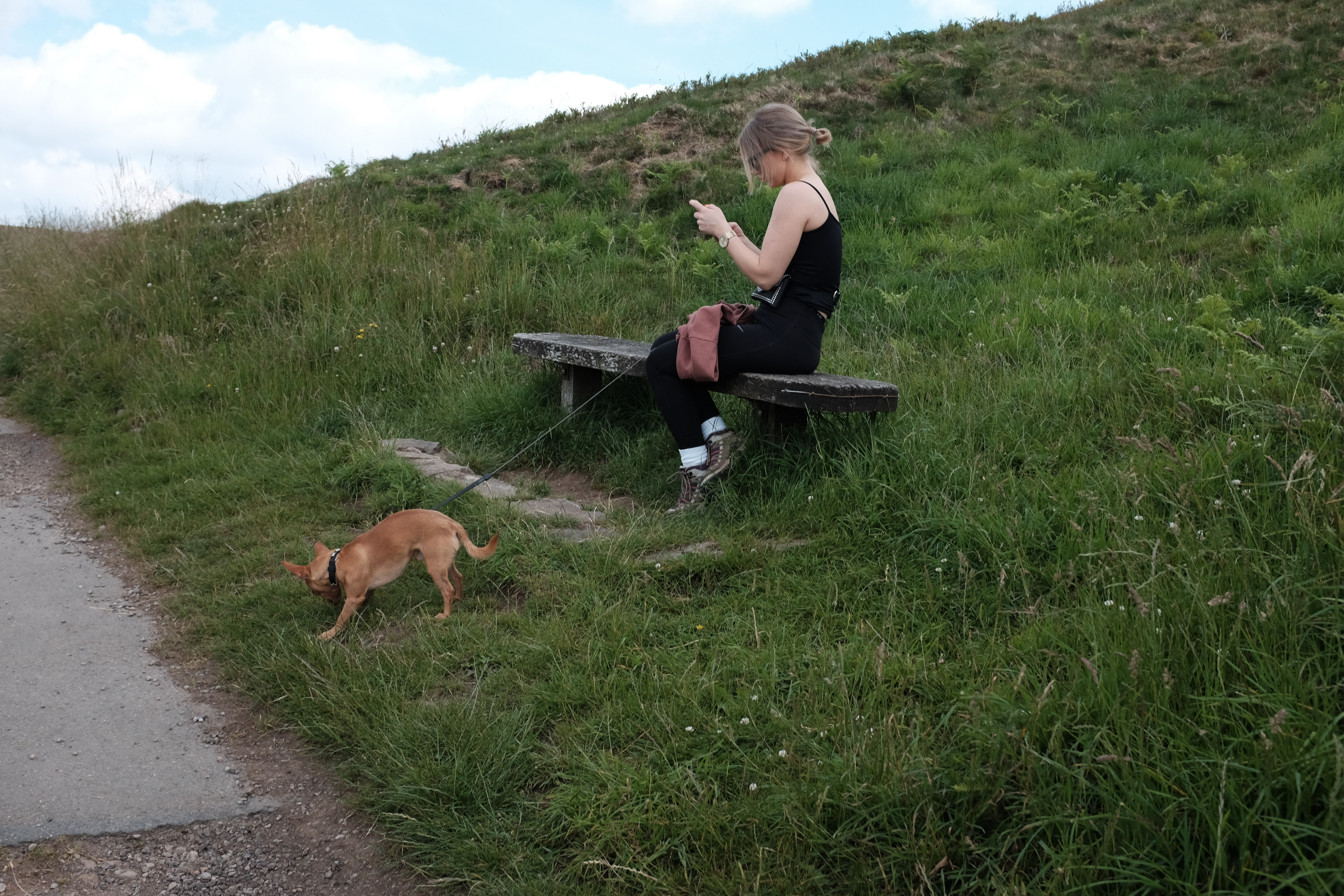
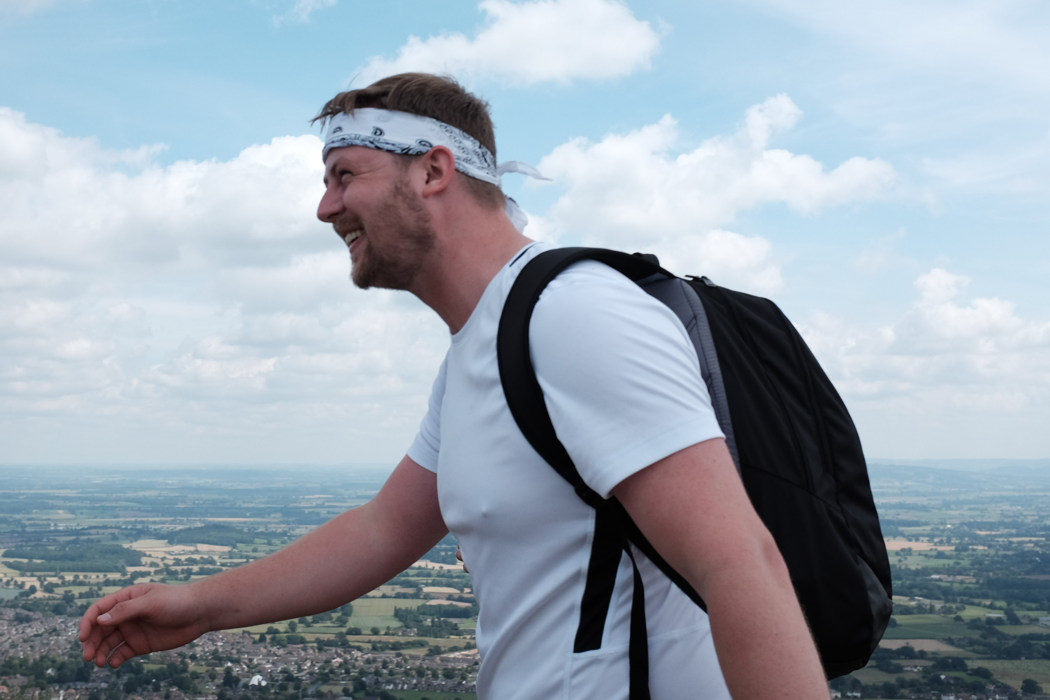
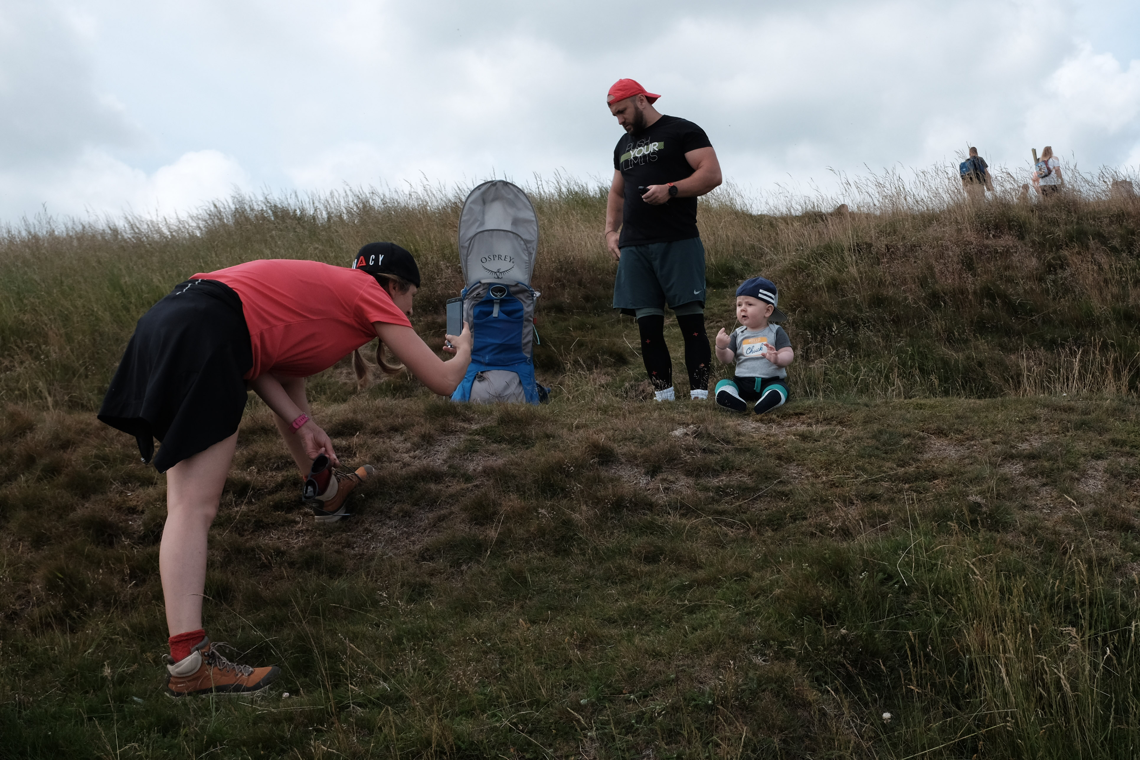
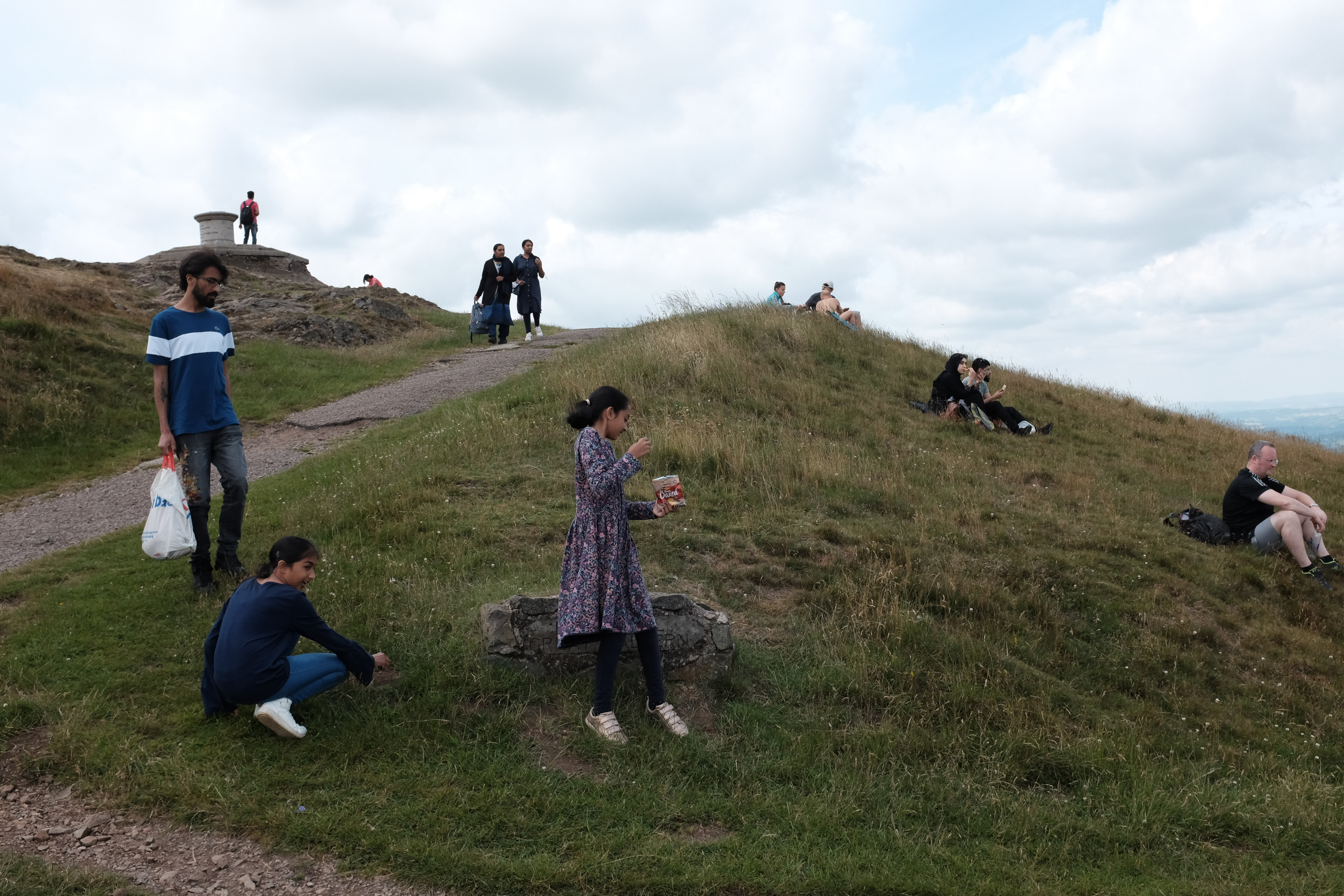
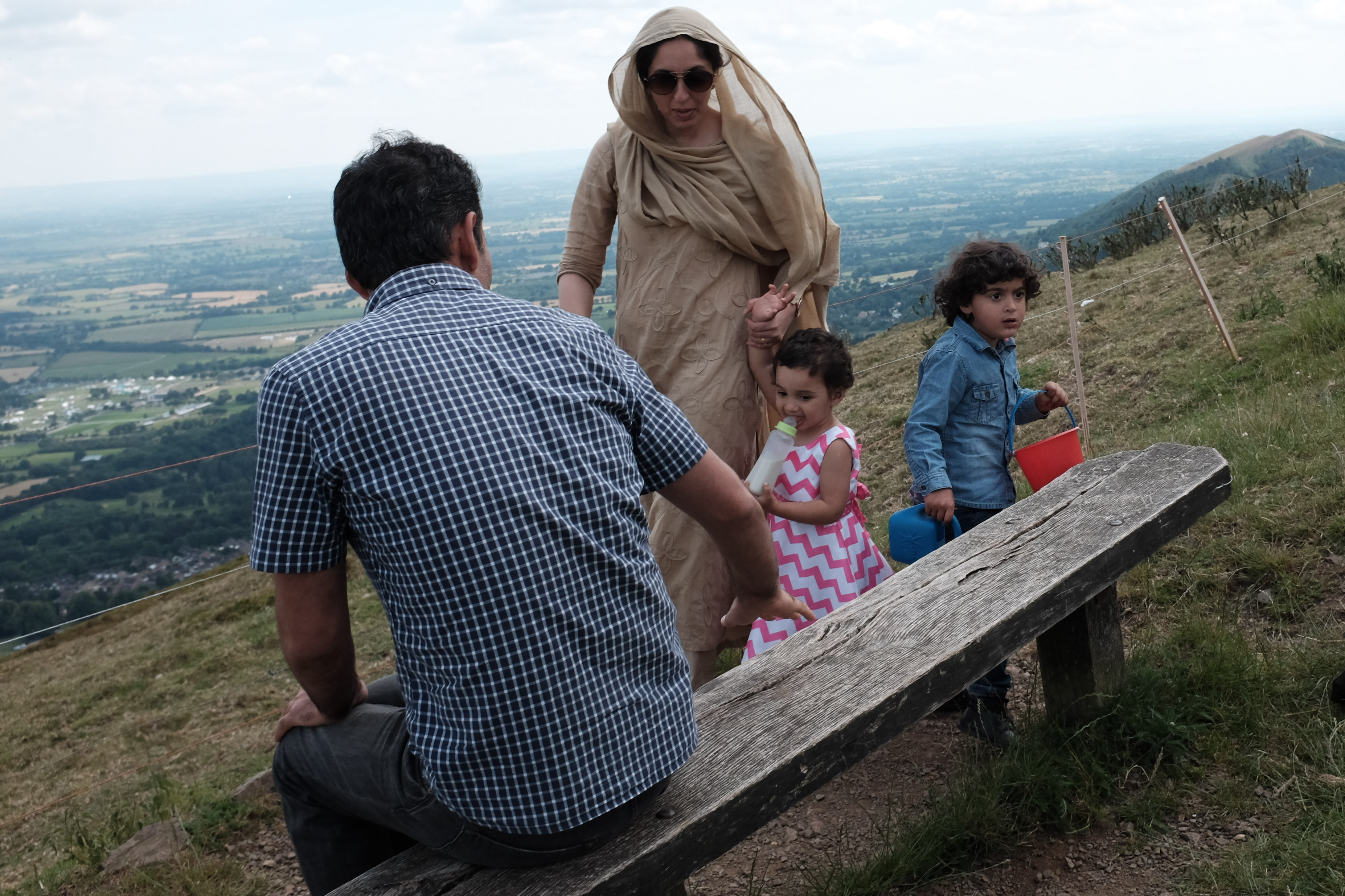
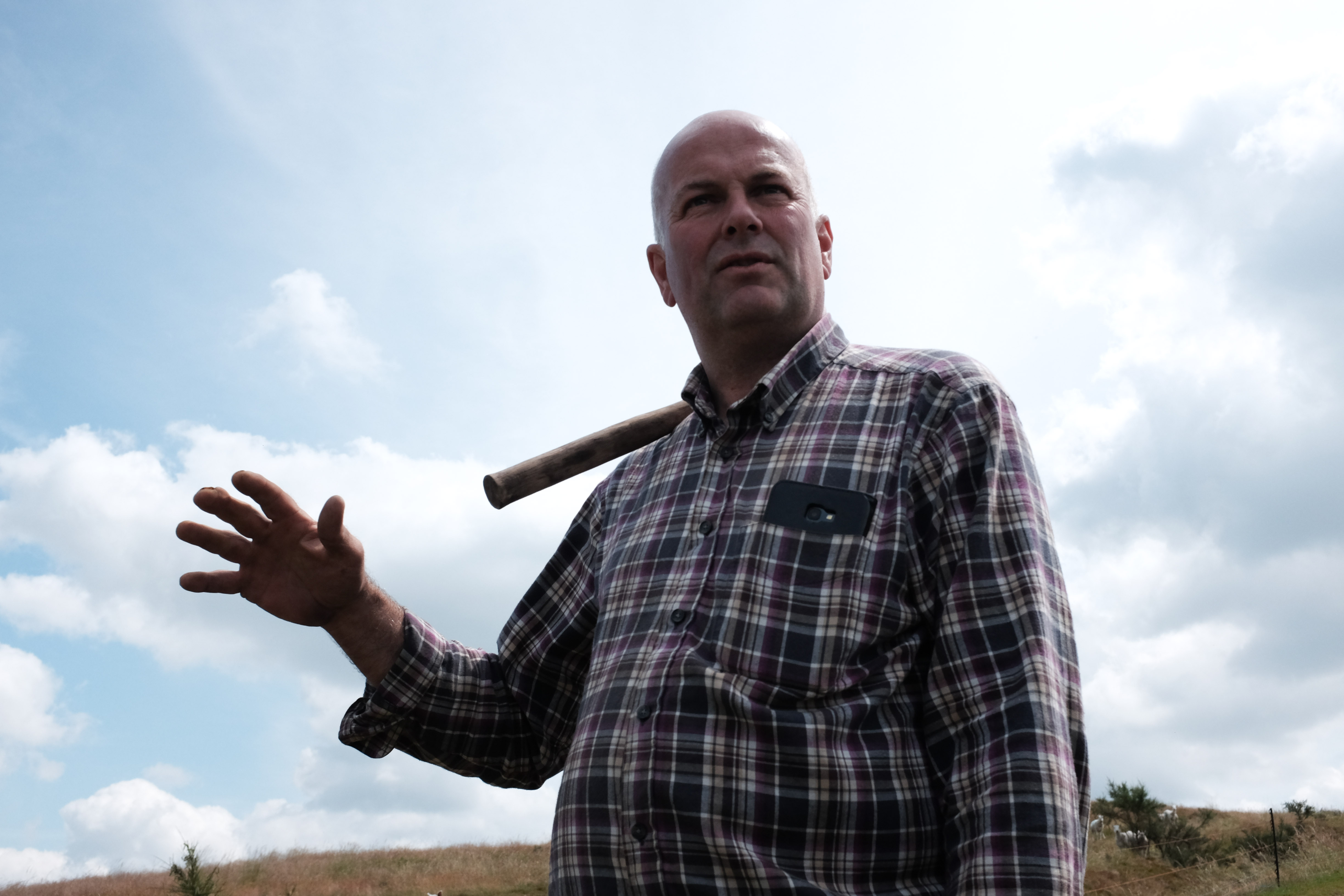
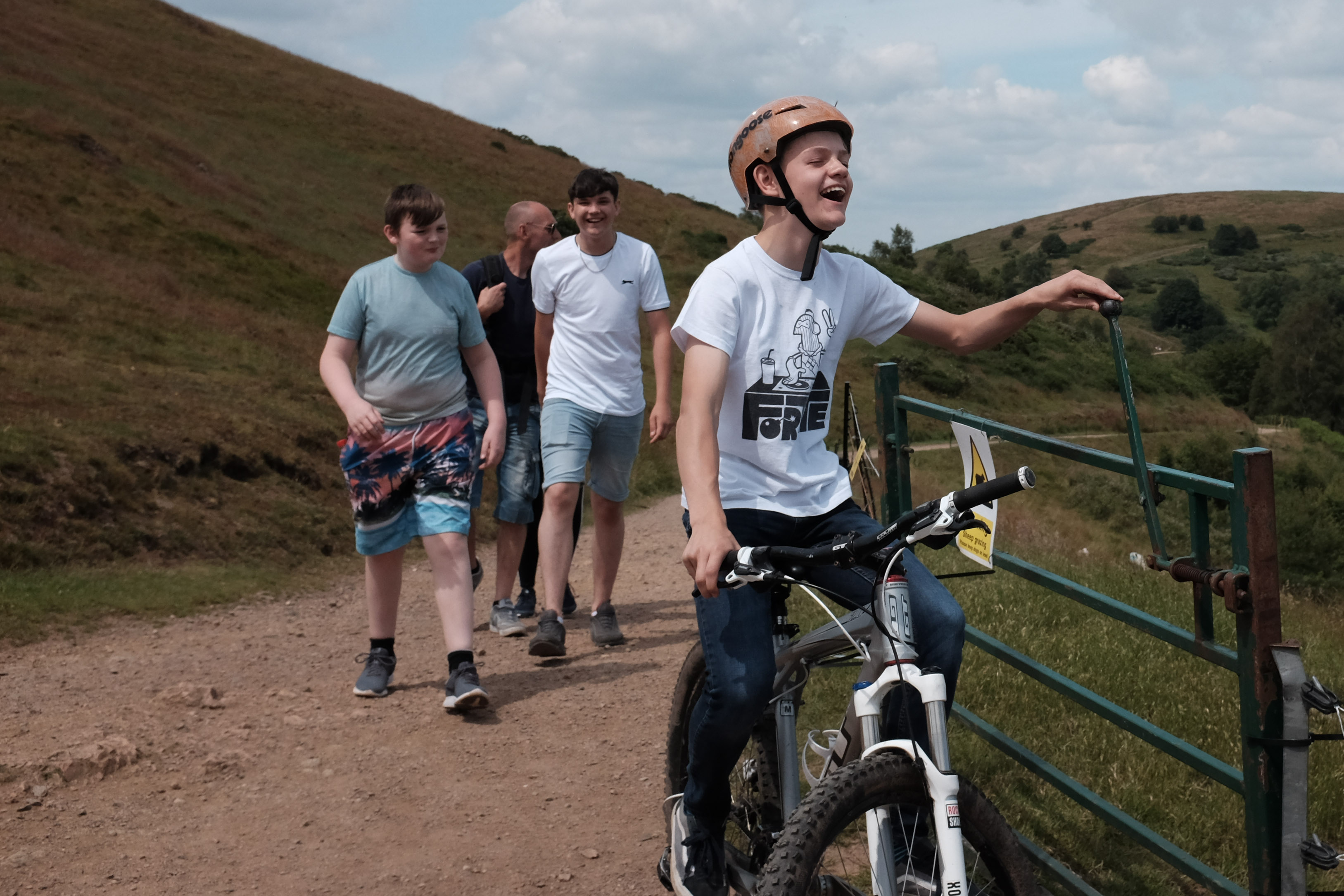
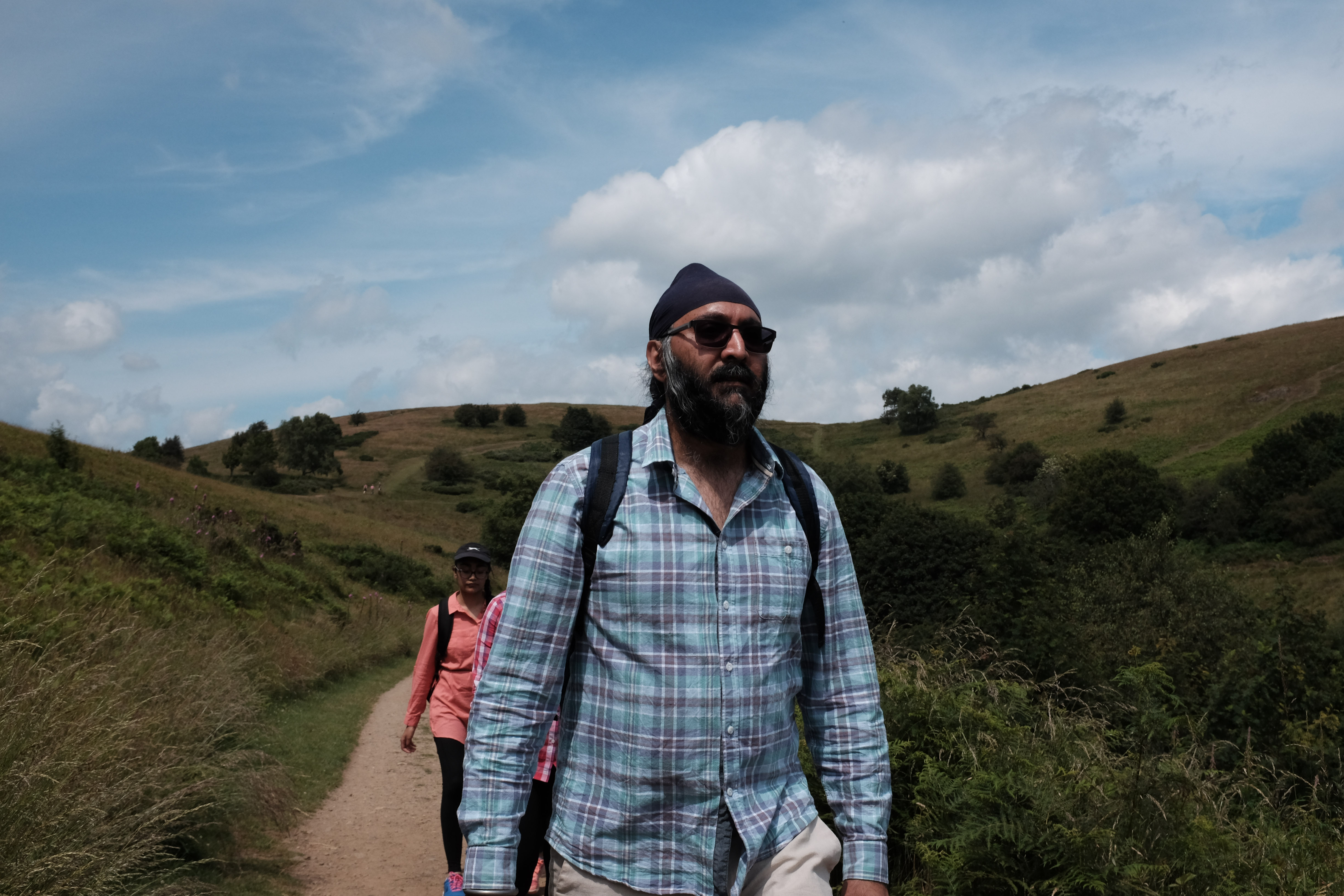
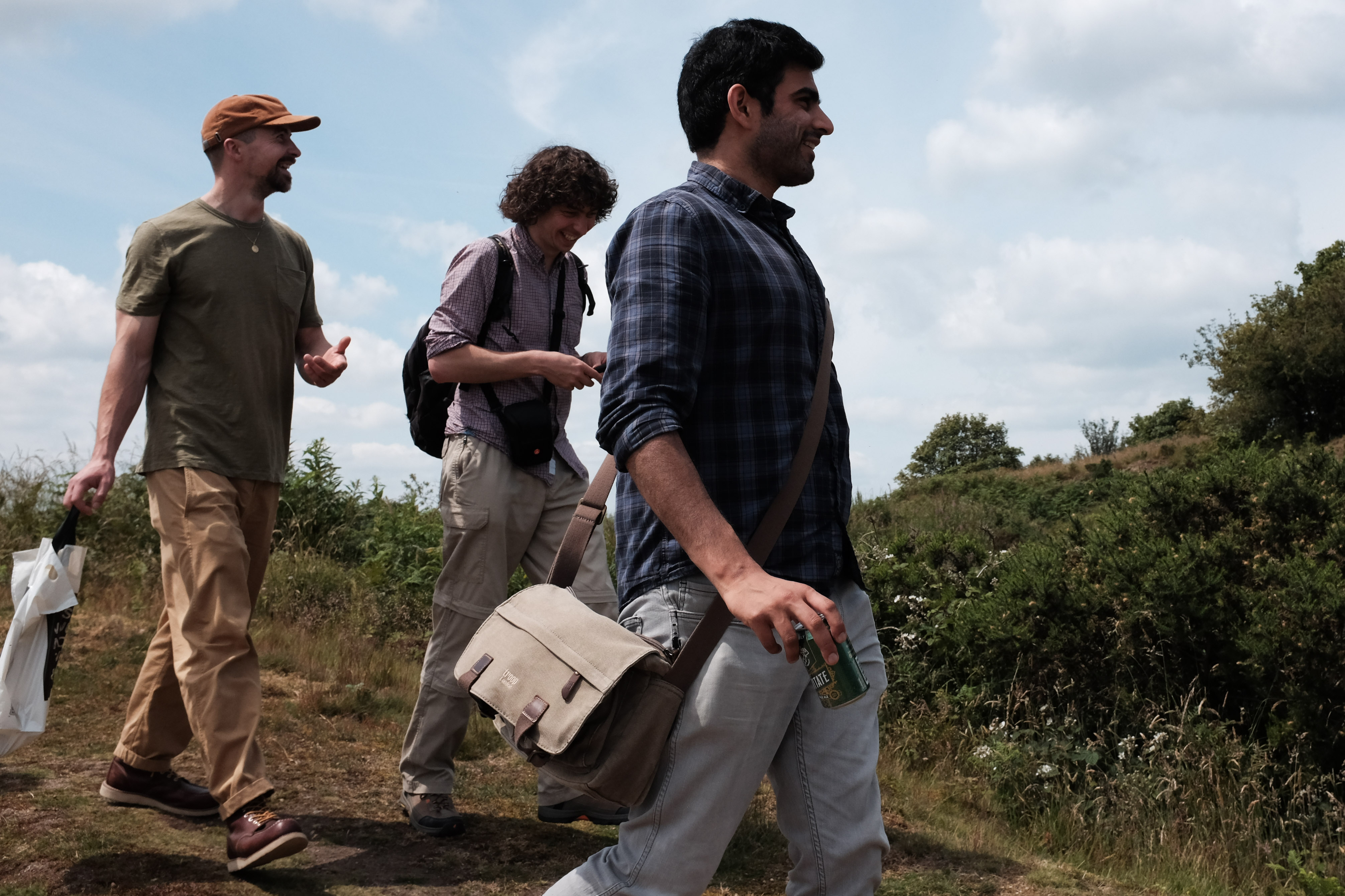
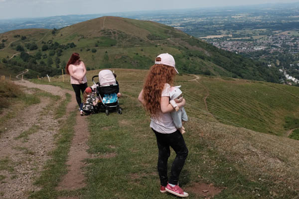
For this exercise I’ve transposed street to mean public and therefore carried out my shoot on footpaths on the Malvern Hills close to where I live. My reason for this was to garner a wider range of human activity rather than shoot in my local town of Worcester where I would be likely to just find shoppers passing me at pace, or people staring into their phones.
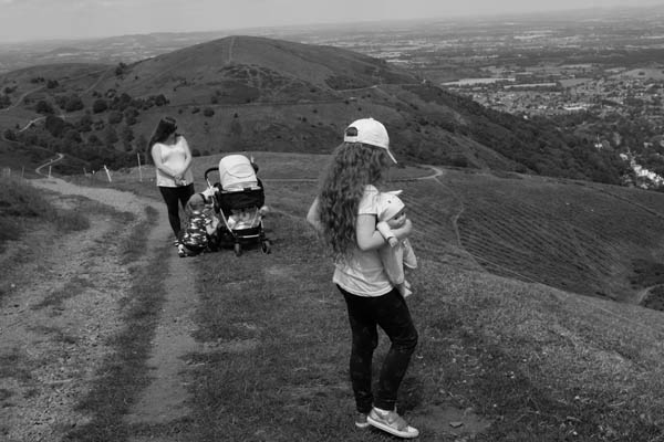
When viewing the two sets of images the main difference between the two is the amount of information contained within the colour set. The colour images are loaded with content helping draw my eye around the whole of the frame. The colour set is closer to reality as we see it, whereas the black and white set relies mainly on shape and form and is aligned to photographic history. The colour images are more contemporary in feel and play to the rational of human experience.
Looking at the two images above, it is noticeable how much information is lost in the black and white conversion. Instantly my eyes are drawn to the subjects hair and the pink of their tops and finally to the girl in the foregrounds shoes. My eyes flit in a triangular shape between all the points of colour reference – this sharpening of visual interest is lost in the black and white image – which is reduced to form and shades of grey.
I think the main point that I have learnt from this exercise is not necessarily regarding the reality of colour and its ability to draw you around the frame, but moreover, I’ve learnt about the reductive nature of black and white and the information that is lost. In so far as to which set I prefer I am quite torn between the two. I do like the graphic and stark qualities of the black and white set, but if push came to shove I would side with the colour images mainly for their realism and for the way that colour has the power to help lead me around the frame, and, as with the images above colour can add punctum.
I can honestly say that the exercise has truly shifted my thinking as I have always been stalwart in my defence of black and white. This is a lesson well learnt.
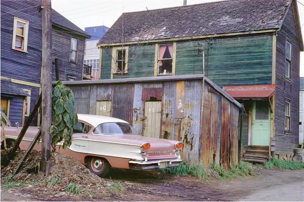
The shift from black and white street photography to colour was a gradual progression over the course of a couple of decades from the 1950’s through to the 1970’s. Three notable luminaries of early colour street photography were; Saul Leiter, Fred Herzog and Vivian Maier.
Herzog, New Pontiac, 1957.
These photographers embarked on their colour street work during the 1950’s, but due to the disregard of colour photography, because of its associations to advertising, they remained undiscovered until much later. Joel Sternfeld and Joel Meyerowitz also produced their own colour street output in the 1960’s. The ground-breaking exhibitions curated by John Szarkowski at the Museum of Modern Art, featuring work by William Eggleston and Stephen Shore, marked the wider acceptance of colour photography by the art world in general, leading to a greater proliferation of colour street work.
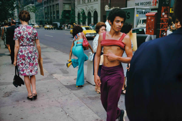
I want to focus on Joel Meyerowitz for a moment, as I think his view is great at summing up the potential of colour photography and also because I have a great deal of respect for him as a photographer and as a person. In his retrospective book Where I Find Myself (I highly recommend this) he states ‘What I saw was that the colour image had more in formation in it, simple as that! There was much more to see and consider, whereas black and white reduced the world to shades of grey.’ (Meyerowitz, 2018, 286). For me this is the crux. The world we see is colour, therefore, black and white reduces it and in so doing it takes away reality. Meyerowitz further adds ‘The sharpness and cohesive quality of the image compelled me to ‘read’ everything in the frame…colour in the distance actually added something to the meaning of the whole frame…” (Meyerowitz, 2018, 286).
Meyerowitz, New York City, 1974.
With regard to the shift away from surrealism I’m not convinced that there has been a shift away from it – with respect of street photography. Although Cartier-Bresson is an exemplar of surrealist street work and black and white is more obviously suited to it, there are many examples of current colour street contemporaries, such as work produced by Matt Stuart. Life can often be absurd, these absurdities play out on the street – because the street is the theatre of life, encapsulating all of humanity in all of its glory.
Stuart, Oxford Street, 2009.
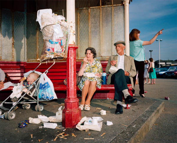
The work of Martin Parr is often described as an ironic view of British identity. Parr’s images show symbols associated with our nation alongside the wit which also typifies us. Whether it be his early black and white images of people scurrying about in bad weather or work from his breakout series The Last Resort – showing us humanity at the seaside surrounded by the artefacts connected to place – he holds a mirror to our society at large. In the past Parr has been derided for his satirical and uncompromising point of view, often being said to be cynical and sometimes demeaning, but are we not as a nation witty, sarcastic and ironic? For me Parr is first and foremost a humourist with an eye for representations of national and regional identity, also showing us the markers that are representative of the various class structures within our society.
For much of the first part of David Campany’s essay; Safety In Numbness, he extols the virtues of the ‘presentness’ of moving images relating to an event, over the use of the ‘frozen’ image which is more readily used as a form of visual punctuation in television stories, stating ‘There is nothing like the ‘presentness’ of the moving image to emphasise the ‘pastness’ of the photograph.’ (Campany, 2003).
Aftermath photography has its roots within the earliest
histories of the photographic medium. Roger Fenton and Ken Burns both recorded
the scenes from the battlefields of The Crimea and The American Civil War respectively.
Their unwieldy equipment and long exposure times predicated the construction of
their images after the engagements of battle had subsided, which, in turn, led
to a more artistic and aesthetic renditioning of the scenes. This measured,
aesthetical approach has been adopted by a number of contemporary photographic
practitioners such as the likes of Simon Norfolk, Paul Seawright, Donovan Wylie
and David Burnett and their resulting bodies of work relate a more
contemplative viewing experience.
The work of these photographers feels as if giving pushback against the fast-paced SLR/DSLR photojournalistic approach of the decades since the mid 1930’s and the chasing of the ‘bang bang’ – which presents the viewer with little or no interpretive responsibility and, although visually impactful, can become lost on the assimilate and move on generations. I’m not saying that these sorts of images are undervalued and less relevant, but I feel that there is room for both aesthetics in priming the memory of the viewer, with the hope of instigating change.
Returning to Campany’s thoughts on the sway of video over still imagery, and the beautification of war through the slower and more considered approach of aftermath photography – obviously, the moving image has great power; it’s in our homes on a daily basis, we consume it and then move on to the rest of our daily business, perhaps relating an opinion to a colleague the next day – but the deluge of daily broadcasts eventually eviscerates thoughts of an event, dulling our conscious. Photography on the other hand, has a greater potential to stop us in our tracks; to impregnate our minds with visceral thoughts, hopefully provoking a response deep within our own personal psychologies and the more contemplative approach of aftermath photography engages us on a deeper level of thought.
Bibliography
David Campany. (2019). Safety in Numbness: Some remarks on the problems of ‘Late Photography’ – David Campany. [online] Available at: https://davidcampany.com/safety-in-numbness/ [Accessed 23 Jul. 2019].